Kateryna Popravkina

Designer · Filmmaker · Marketer

kapopravkina@gmail.com Scroll
Portrait of Kateryna Popravkina

AboutMe

I'm Katya — a designer, filmmaker, and marketer. Somewhere between the three I found what I love most: helping people tell their story in a way that actually feels like them and finds their true audience.

I work with businesses and educators on the things that matter to them, always thinking about who's on the other side. Outside of client work, I make art that explores sensitivity and trauma — the kind of human experiences that don't always have easy words.

I moved to the U.S. from Ukraine and earned my BA in Film and Graphic Design. A fun fact about me — I also have a Master's in Speech Therapy and Special Psychology. That background shaped how I see design: not just as something visual, but as a way of communicating and making things understandable.

Selected
Work

  1. 01.Identity & BrandingQuest · Grind · Chocolove
  2. 02.Posters & IllustrationsDiogenes · Editorial
  3. 03.Interactive DesignBottle · HSP
  4. 04.Film & MarketingDina Saalisi · UGC · Albedo
01

Identity & Branding
Wordmarks, packaging and brand systems built from sketch to applied finish.

Brand Identity · VR
Quest

Description

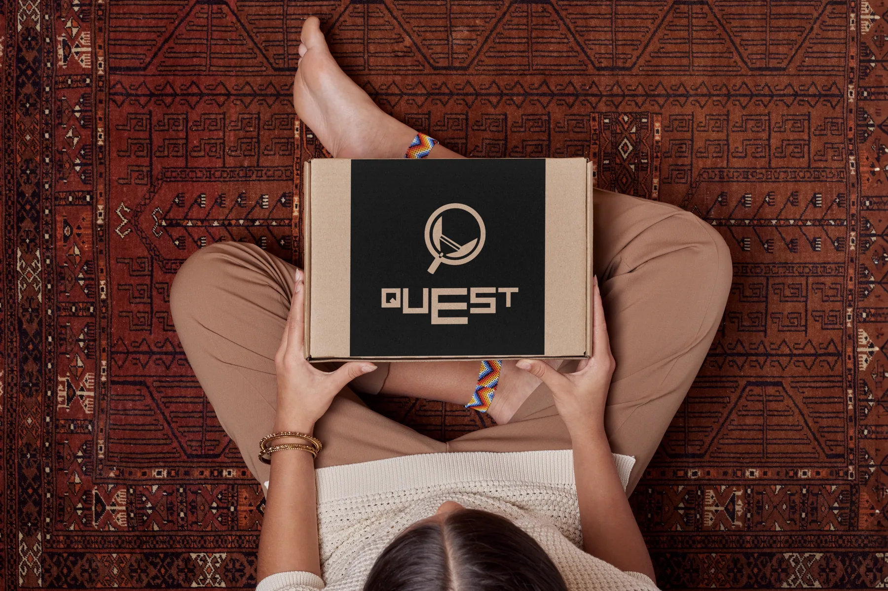
Quest is a virtual-reality experience brand focused on exploration and interaction inside digital worlds. The goal was to create a logo that feels intuitive, dynamic and easy to recognise on screen.

Concept

The symbol is based on a lantern — guidance and discovery. In a VR quest environment it acts as a companion: every step reveals something new. Minimal form keeps it clear; the light suggests direction, curiosity, and exploration.

Quest brand packaging — branded box held in hands on patterned rug
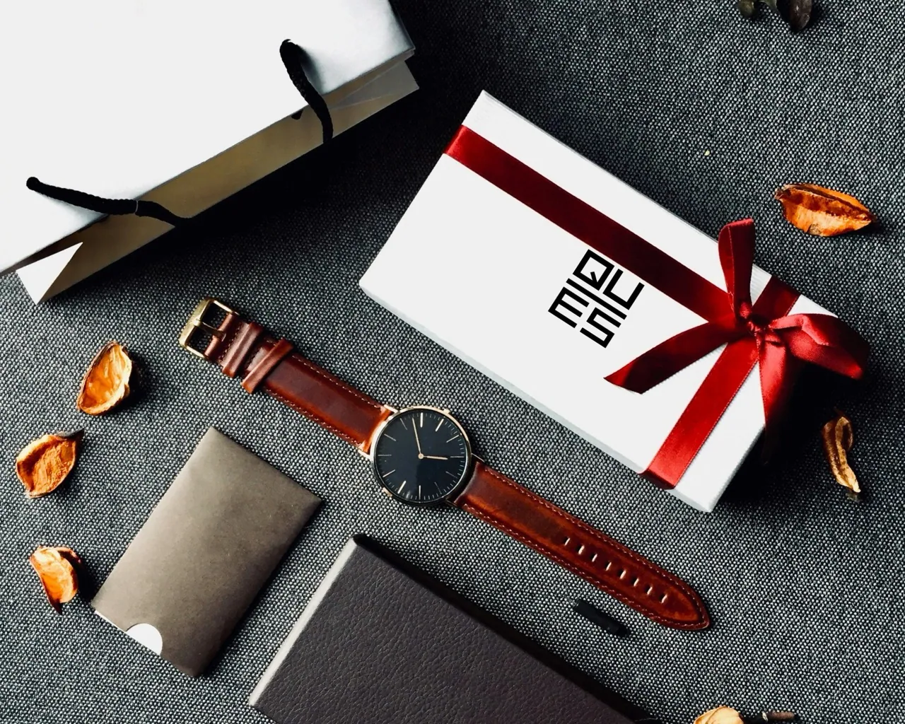
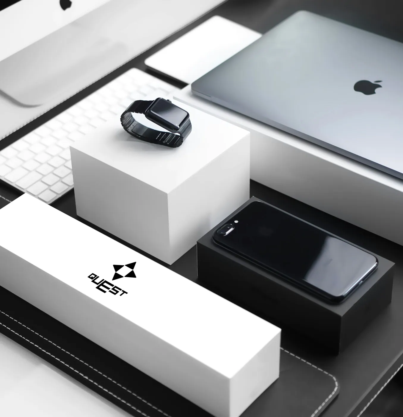
Quest logo explorations and mockups on watches, gift bags, and product packaging
Explorations — two letterform directions: structural typography (1) and movement-based arrows (2). The lantern concept emerged as the strongest.
Brand Identity · Café
Grind

Description

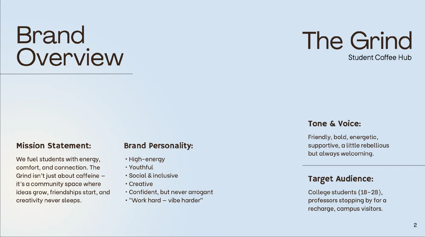
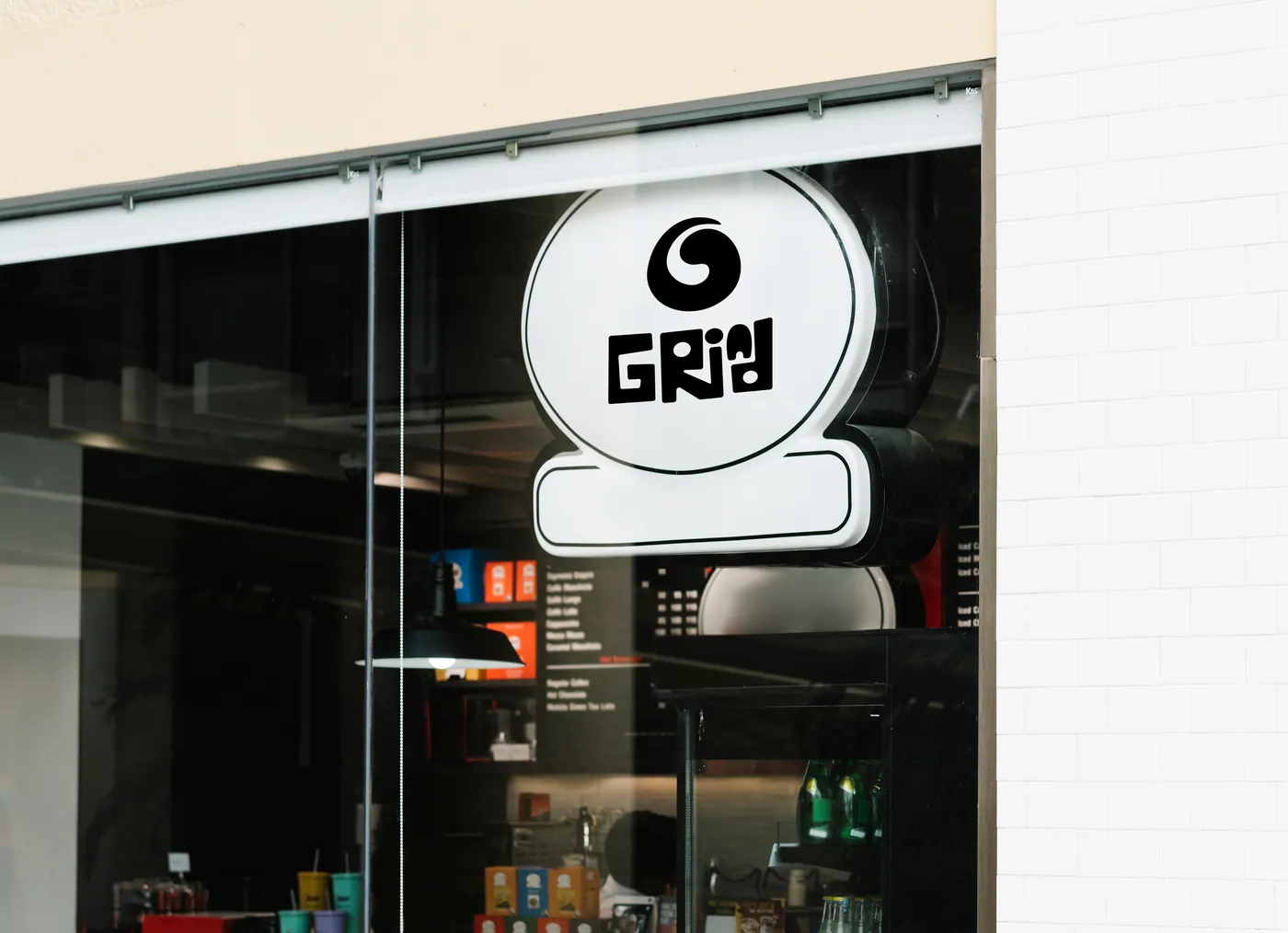
The Grind Café is a student-centred coffee brand — more than a place to grab a drink. The concept focuses on energy, connection and creativity: a social hub where students work, recharge, and build community.

Concept

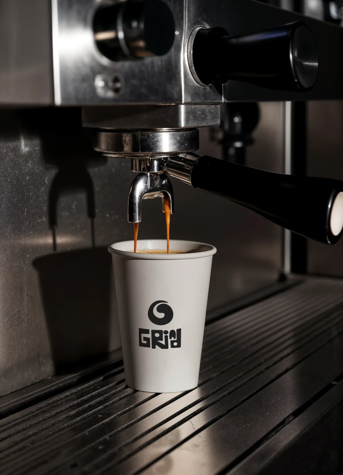
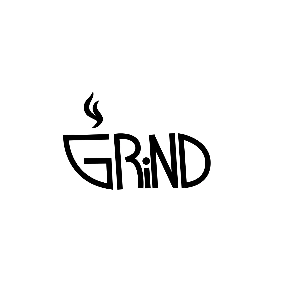
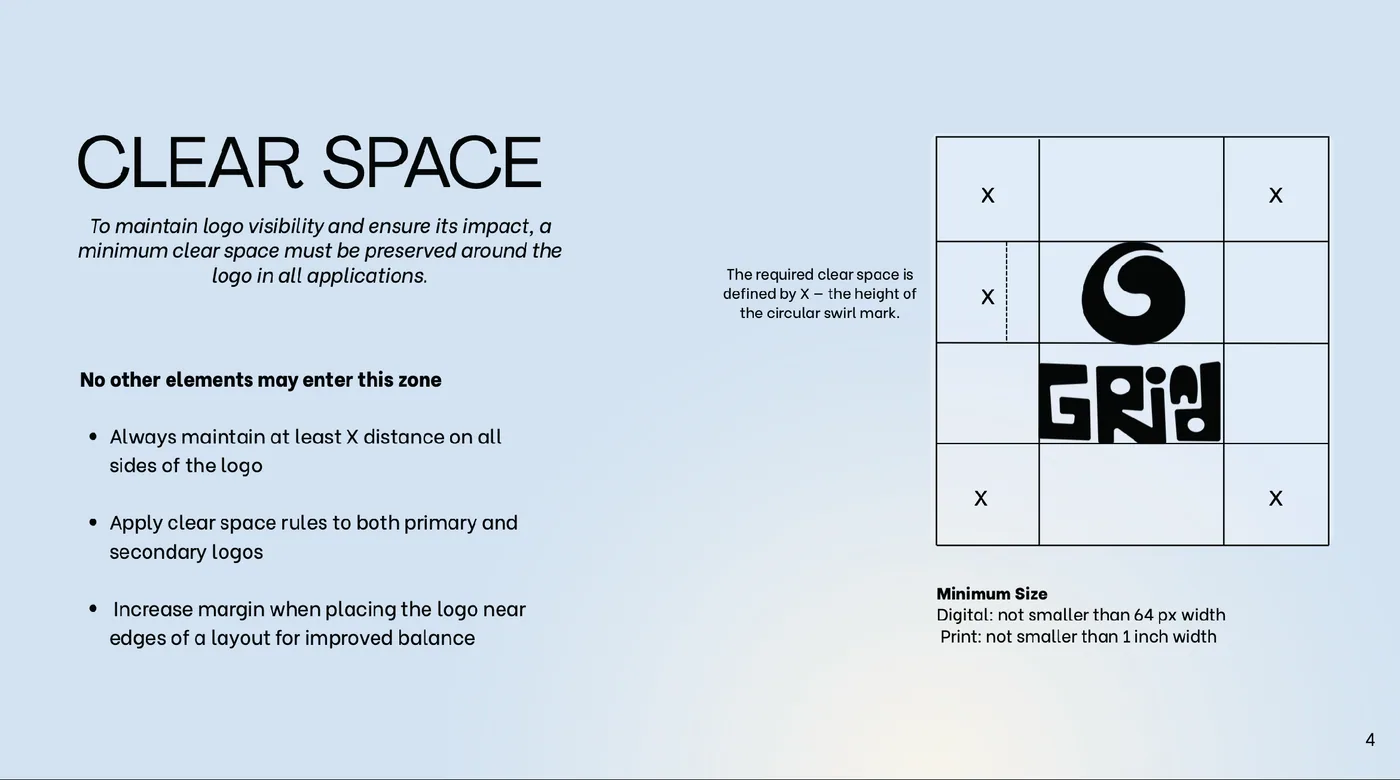
Built around energy and flow, inspired by coffee and the rhythm of student life. The circular mark reflects movement and continuity — a swirl of coffee, a moment of recharge. Lettering is bold, playful and slightly irregular: human, expressive, imperfect.
Grind café — espresso pouring into a branded cup
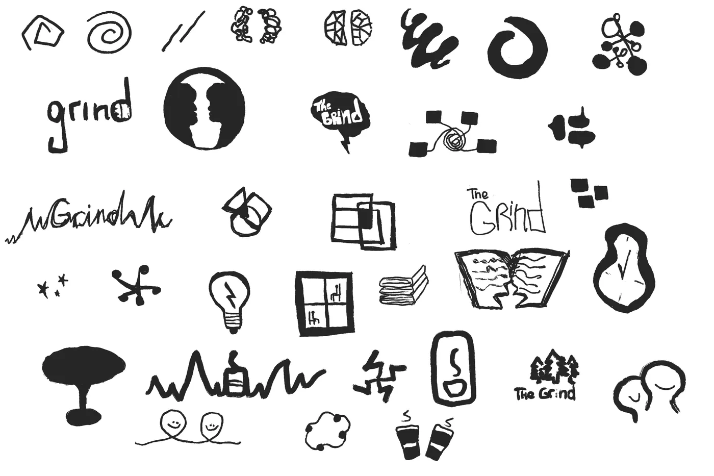
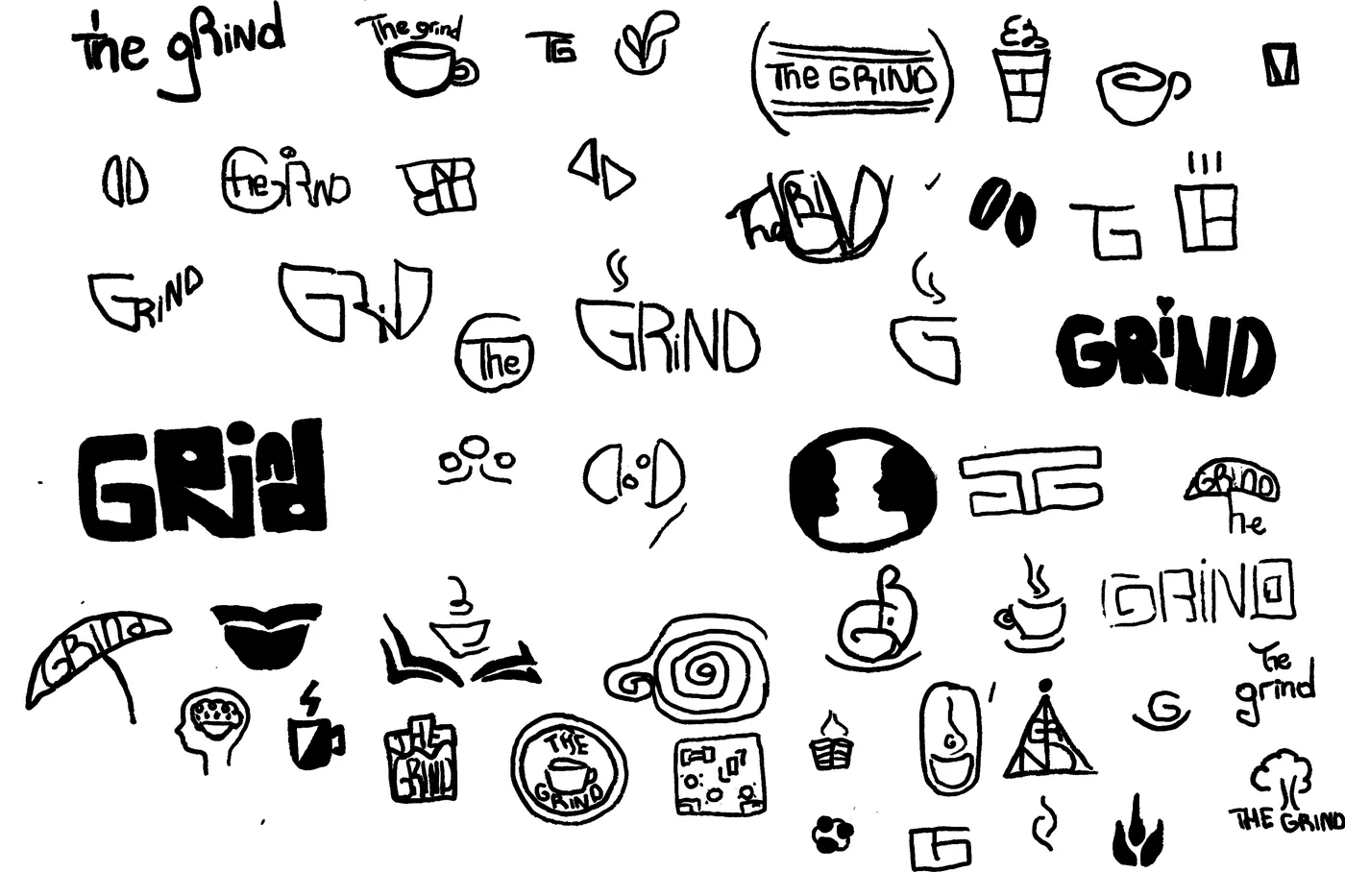
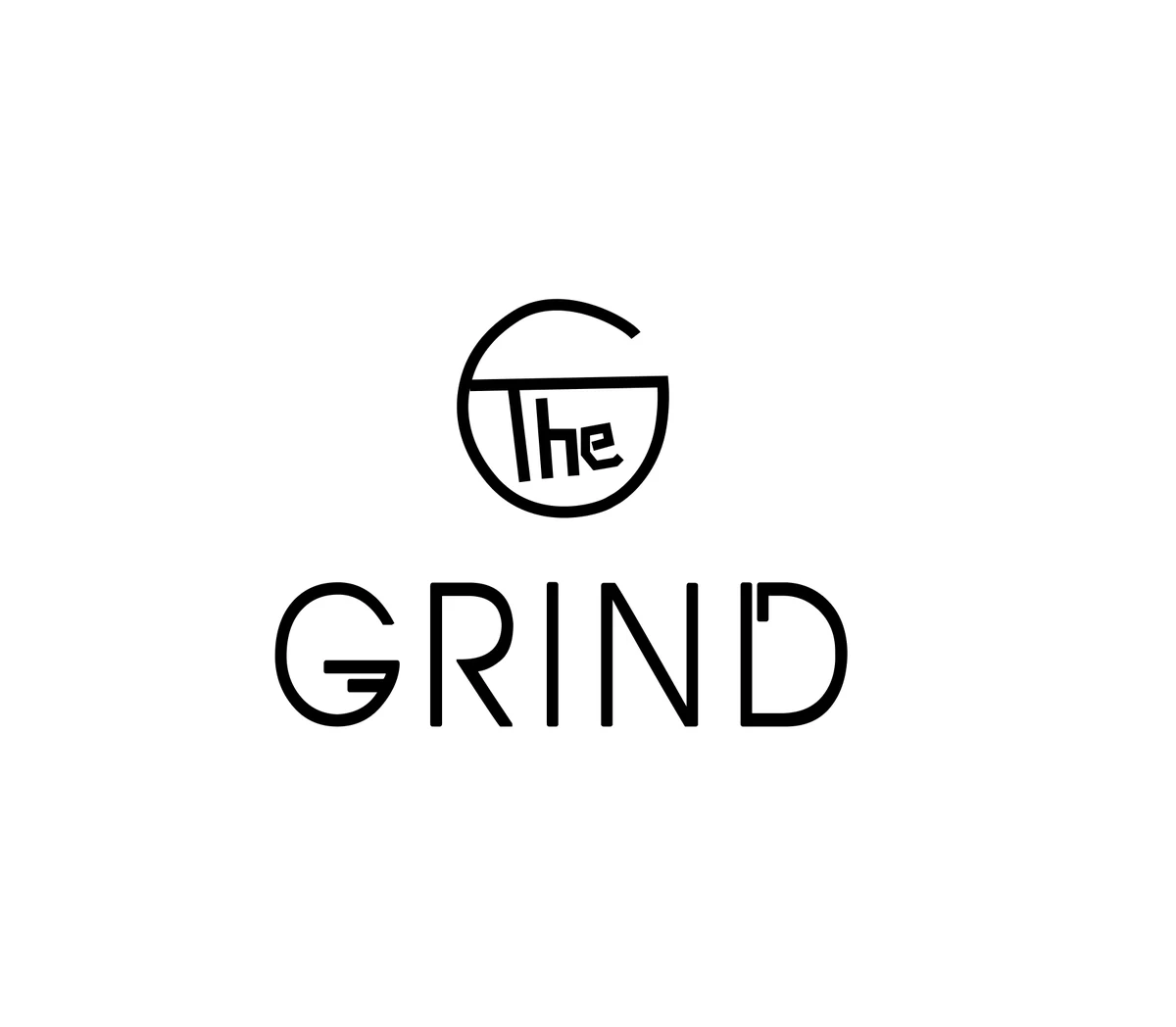
Grind brand exploration — sketches, logo refinement, and brand style guide pages
Sketch exploration and brand style guide — wordmarks, combination marks, and symbol-based logos systematically classified to push beyond first ideas.
Packaging · Redesign

Chocolove

Description

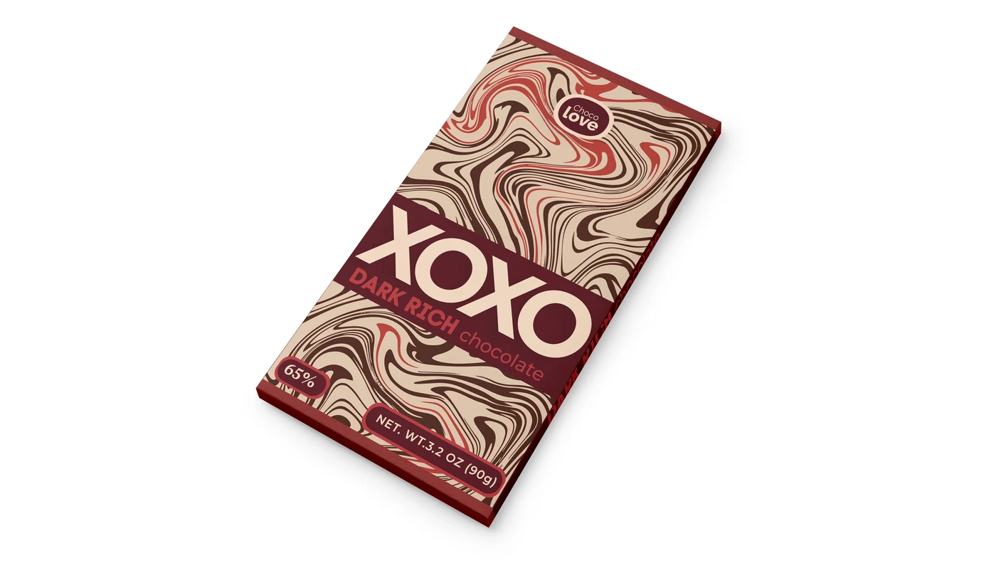
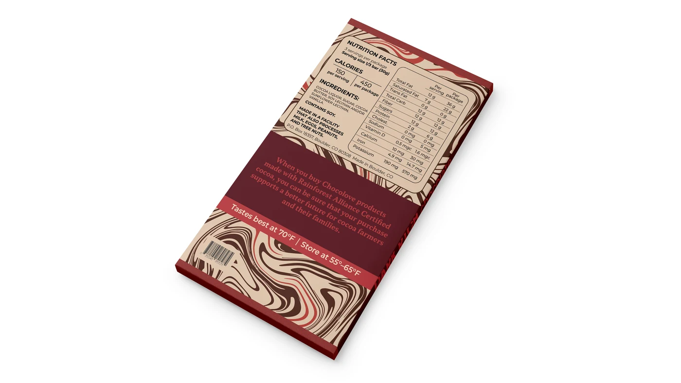
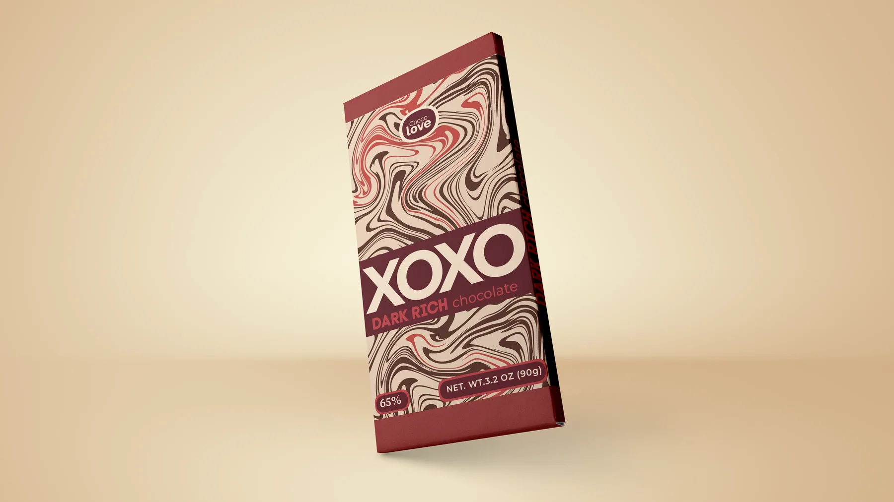
A redesign of the Chocolove chocolate brand. The new package feels bold, modern and emotional — still connected to the original idea of love. Rich colours, expressive patterns and large typography help the bar stand out and feel personal, warm, giftable.

Concept

Chocolate as a small love note. The name "XOXO" connects to hugs, kisses and affection; the swirling pattern adds movement and emotion like melted chocolate or a handwritten message. Deep red gives the bar a rich, romantic feeling.

Chocolove XOXO Dark Rich chocolate bar packaging — red swirling pattern
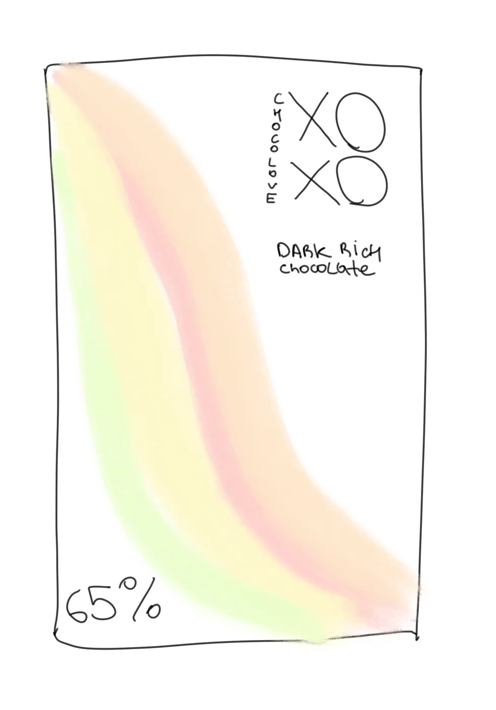
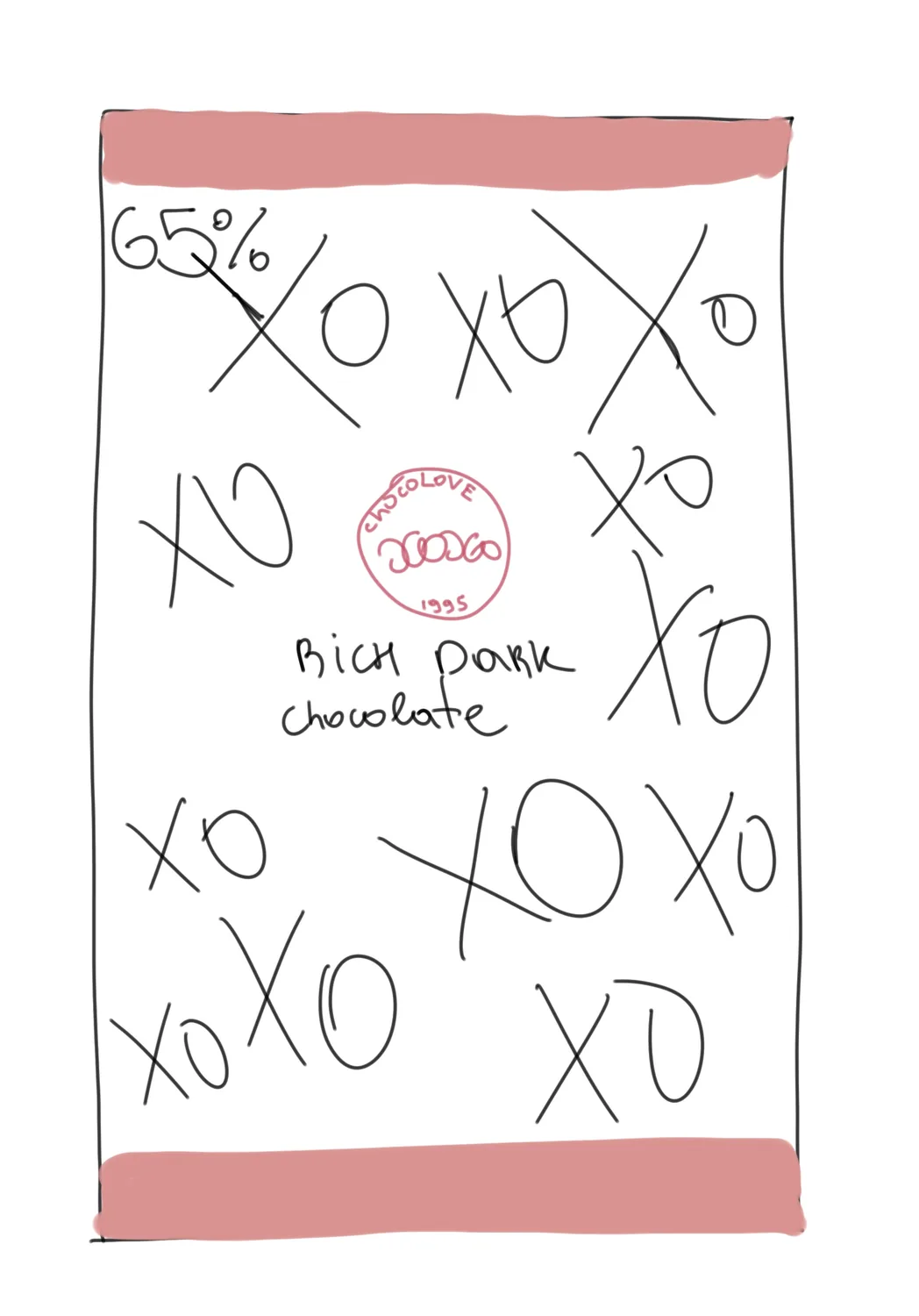
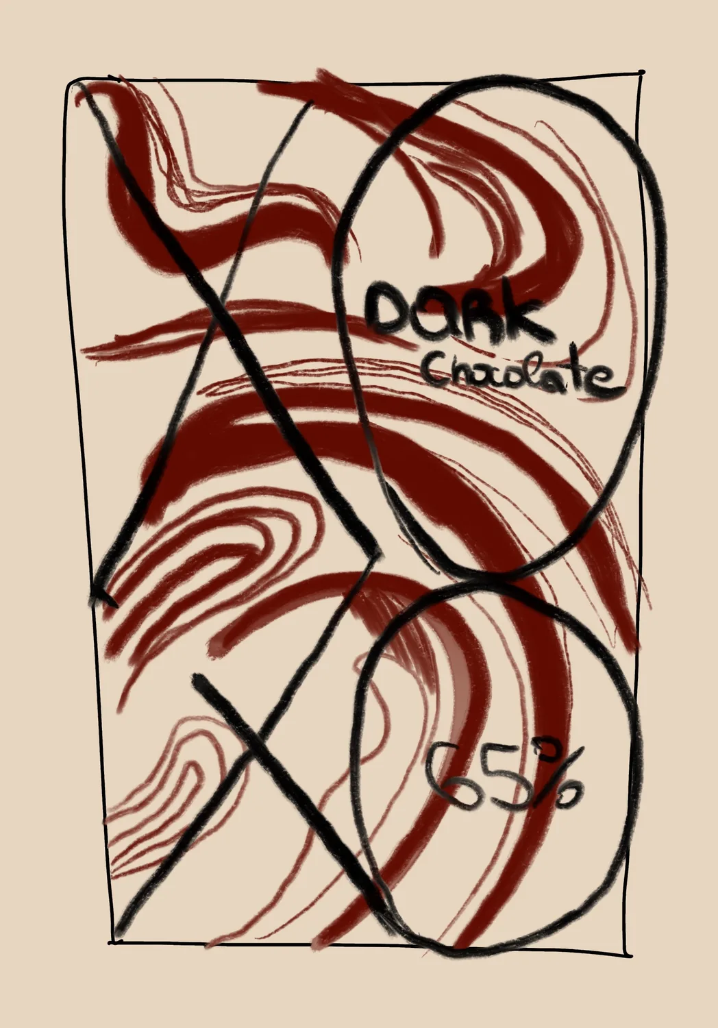
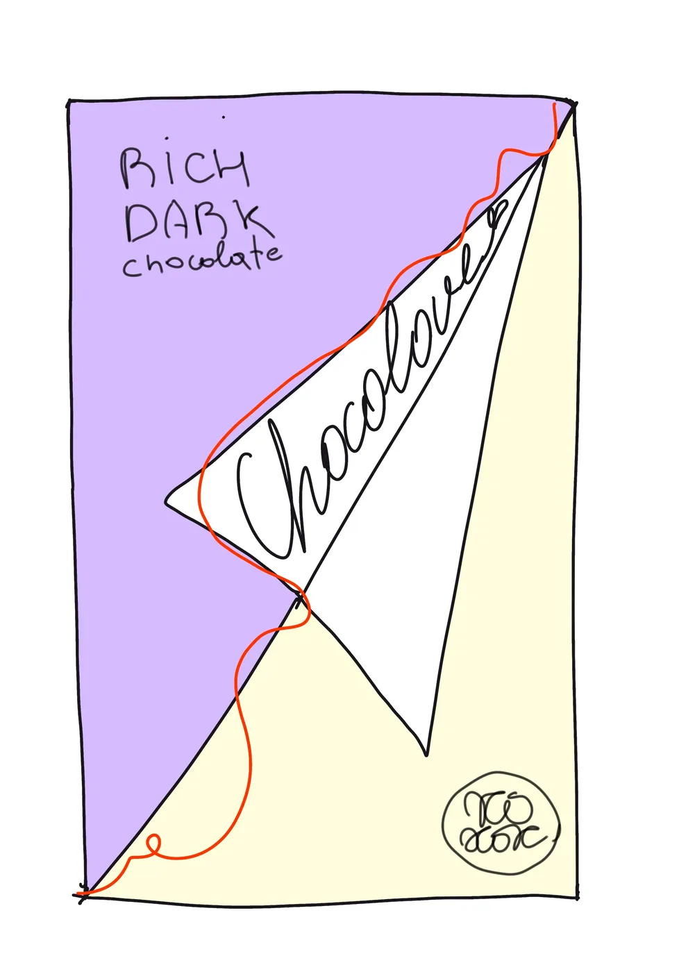
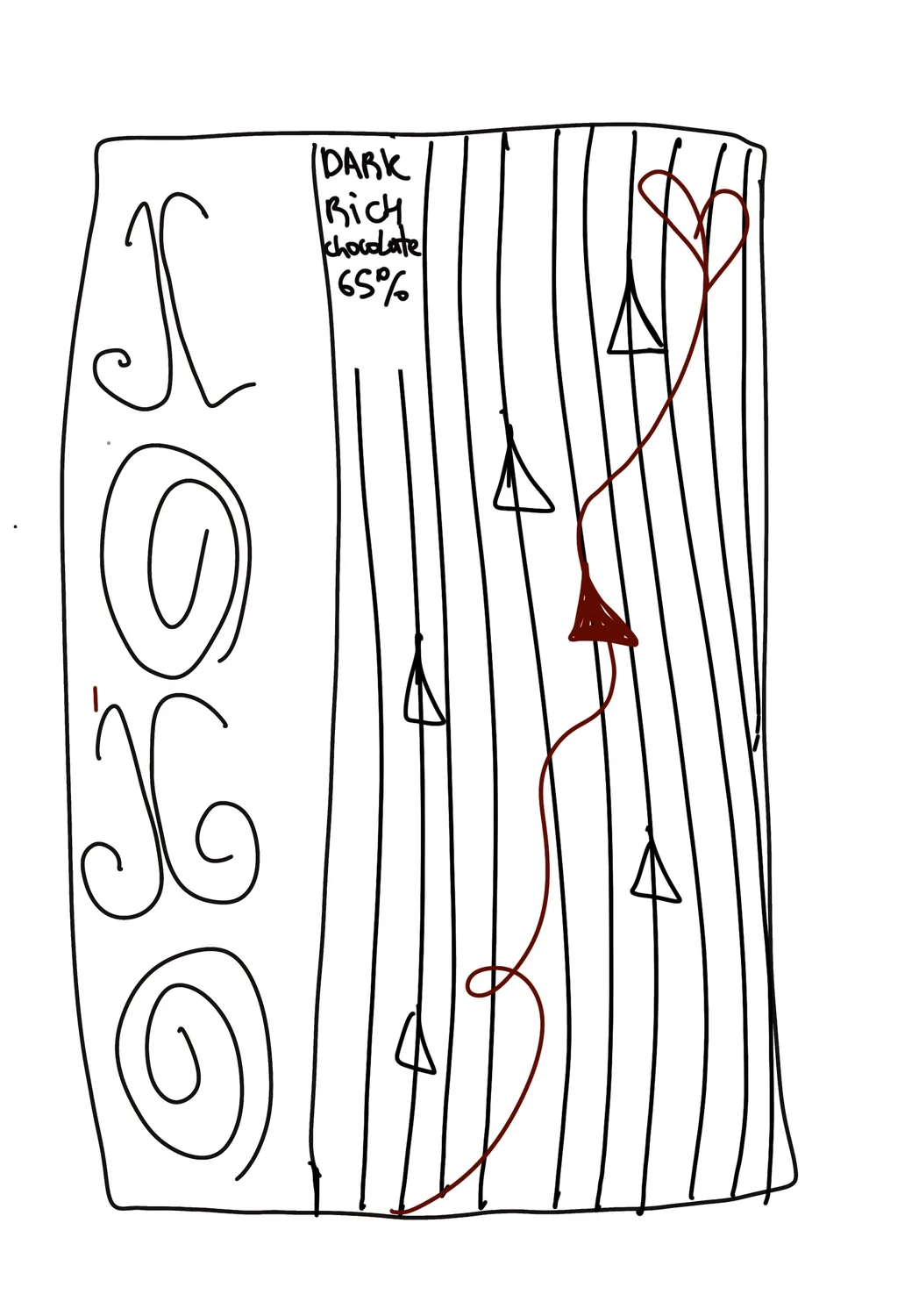
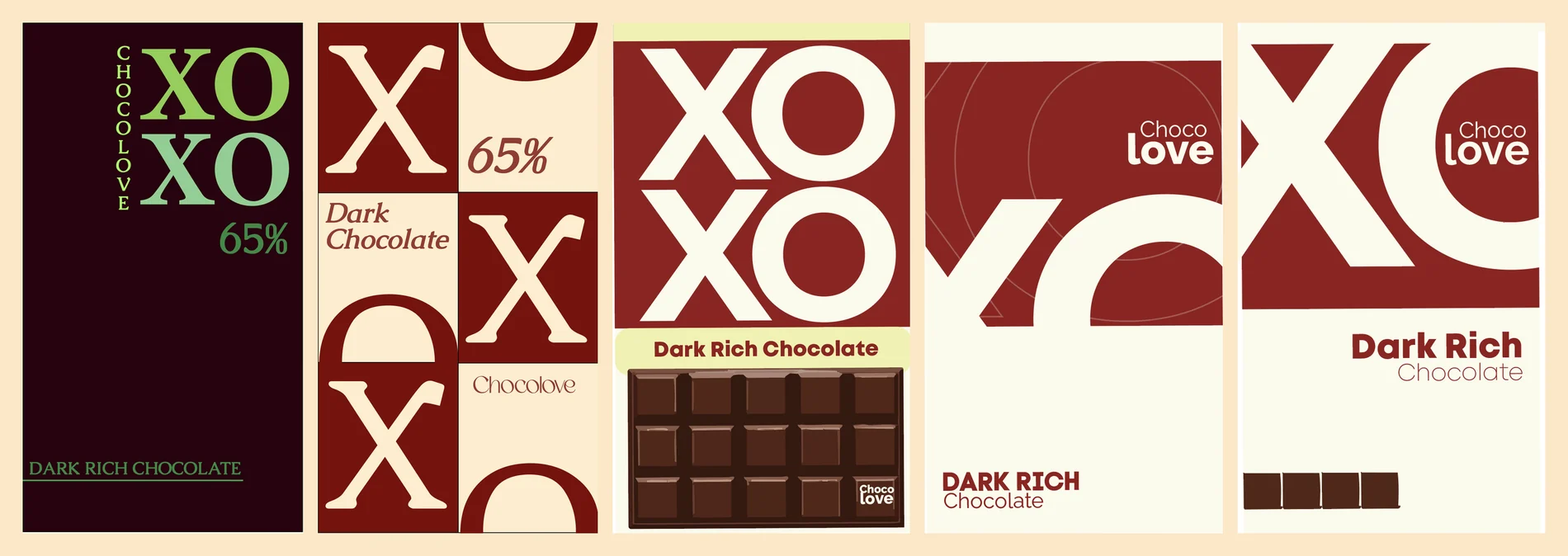
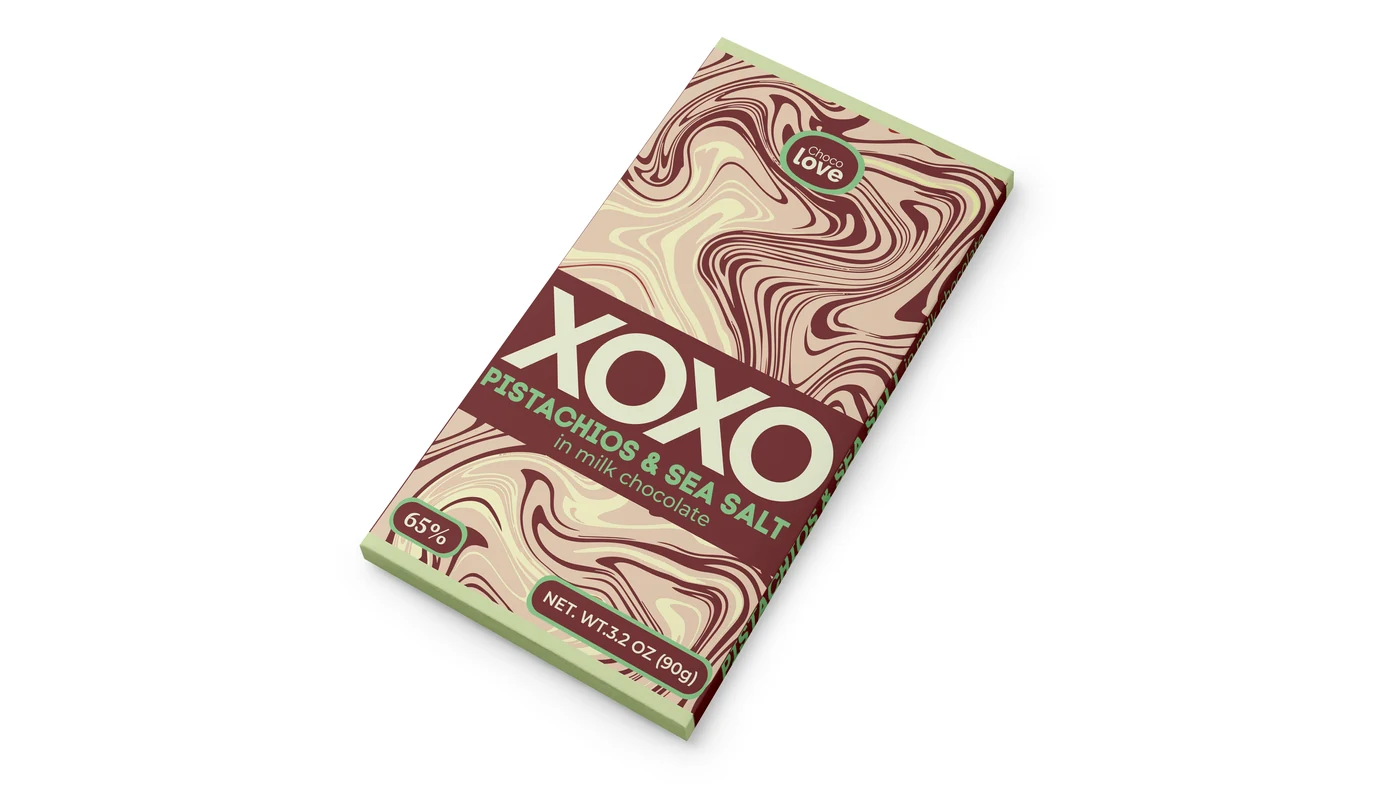
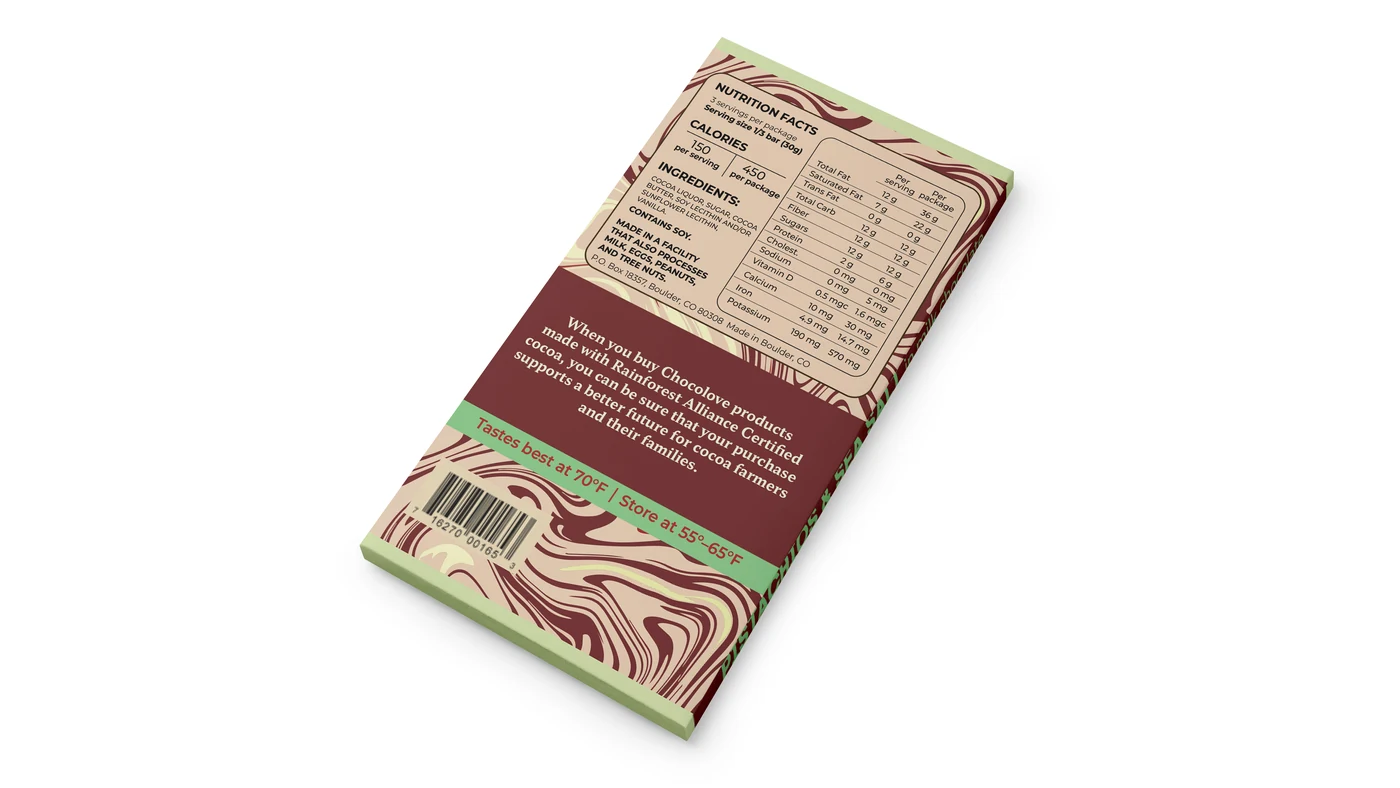
Chocolove early sketches, dark rich and pistachio sea salt variants, digital typography explorations
Two flavours, one system — Dark Rich (deep red) and Pistachio & Sea Salt (softer green accent). The XOXO idea emerged through tighter sketches and typographic studies.
02

Posters & Illustrations

Editorial print and illustration — cinema, fragrance, and quiet emotional states.

Print · Film Festival

Diogenes Film Fest

Description

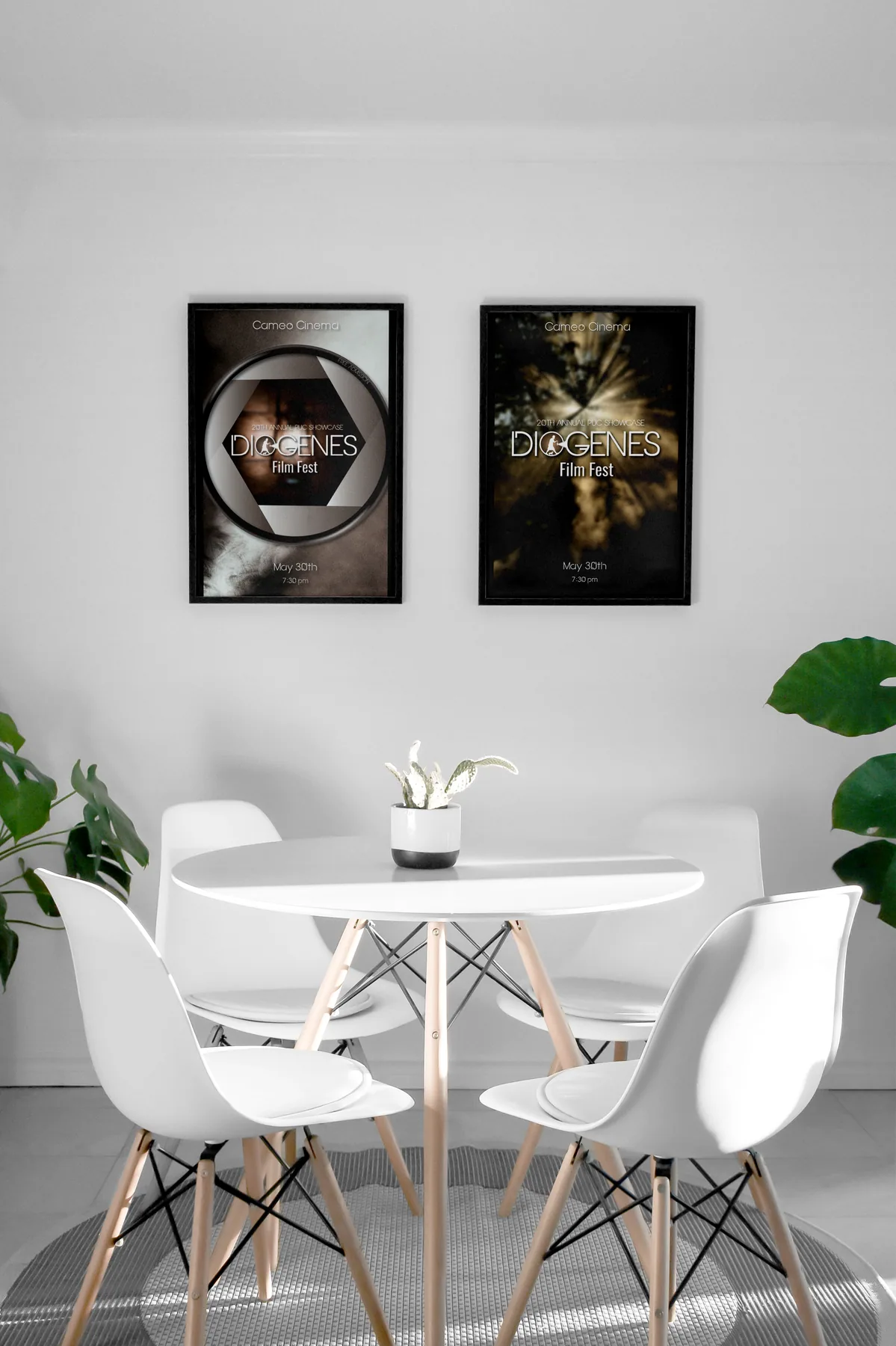
Posters for the Diogenes Film Festival at Pacific Union College — an annual student showcase of films created throughout the year. The festival celebrates storytelling and creative expression, giving emerging filmmakers the opportunity to present their work in a professional setting.
Concept

Both posters explore cinema as a way of perception. The first focuses on the camera lens — a symbol of control and framing — emphasising structure and intentional composition. The second shifts toward atmosphere, using light and blur to create a more emotional, immersive experience. Together they reflect the dual nature of film: precise and subjective.
Two Diogenes Film Festival posters framed on a wall — one with camera lens, one with light streaks
Illustration · Editorial

The Scent of the Soul & Train Girl

The Scent of the Soul

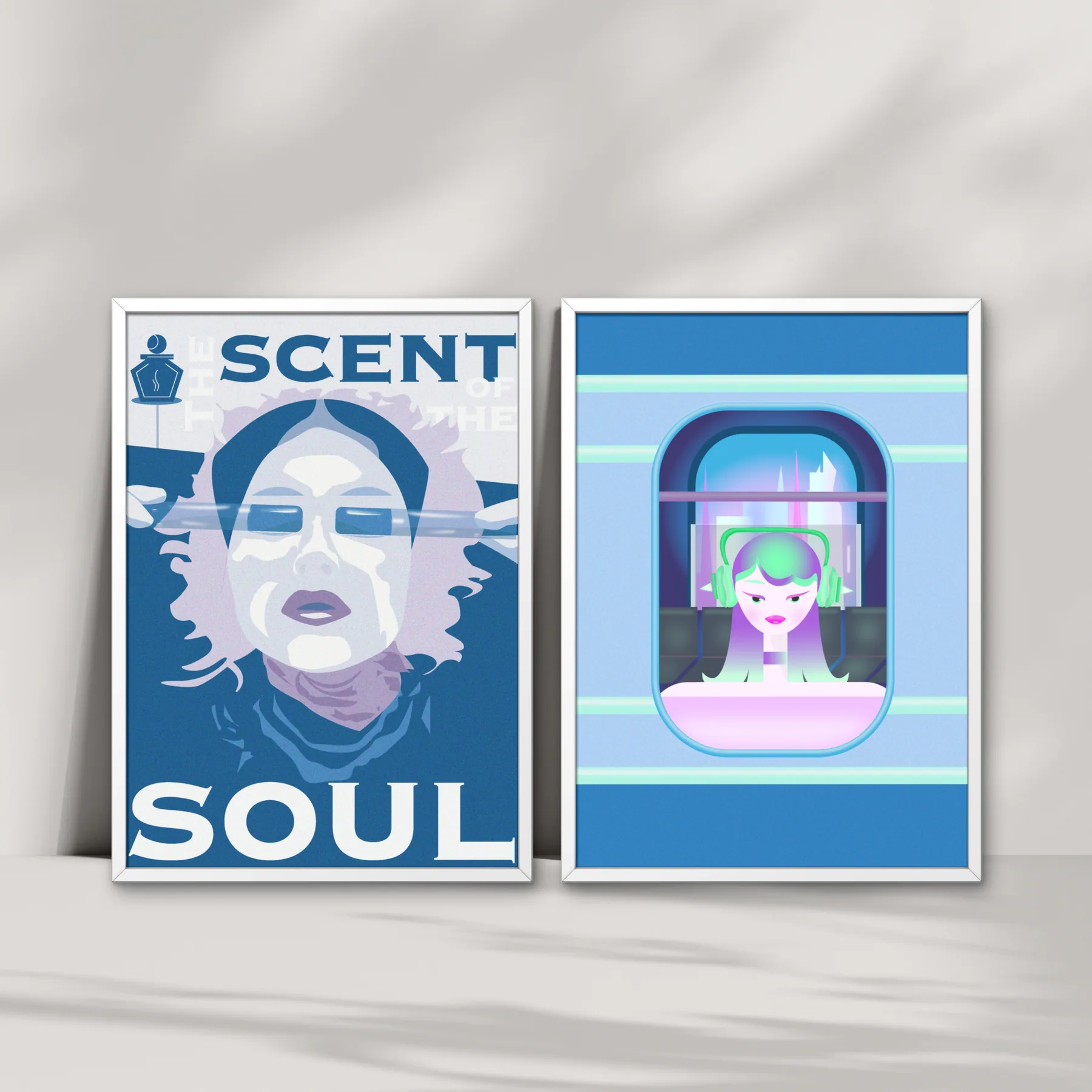
Inspired by a close friend with a deep passion for fragrances. Her personality is layered and rich — that became the core idea behind the piece.

Train Girl

A quiet emotional state during travel. The character is physically moving but mentally somewhere else — present and distant at once, highlighting the contrast between environment and inner experience.

Two framed illustrations — The Scent of the Soul (blue tones) and Train Girl (cool blue with figure in train window)
03

Interactive Design

App and web prototypes that turn intangible feelings into navigable spaces.

Mobile App · Concept

Bottle

Description

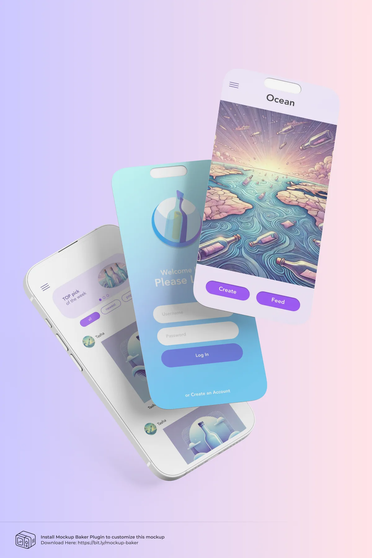
A mobile app inspired by the simple idea of writing a message, placing it inside a bottle and sending it into the sea for a stranger to find.

Concept

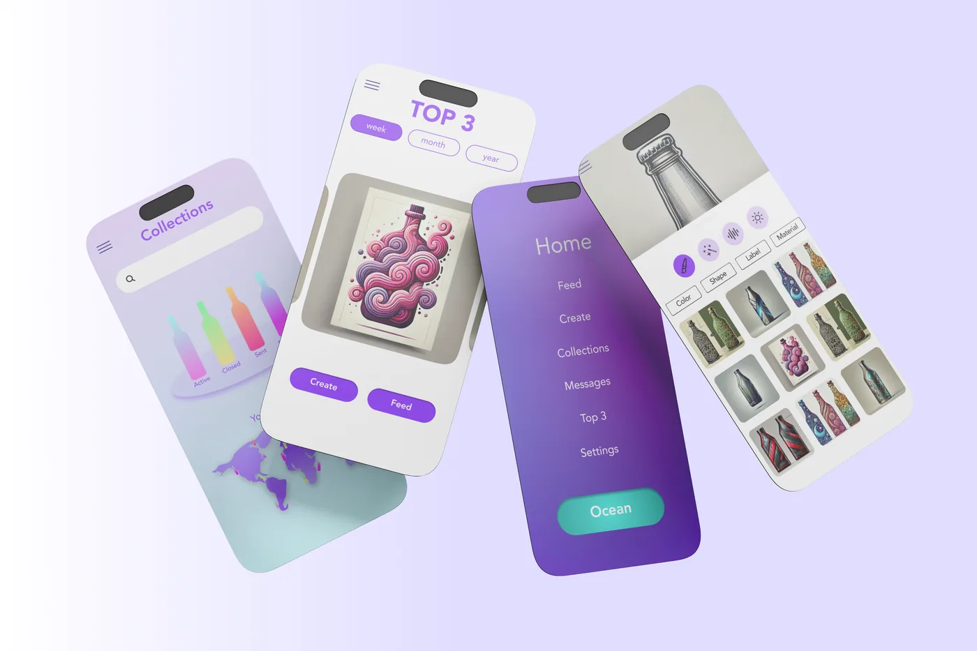
Users write a short message, seal it inside a virtual bottle and release it into a digital ocean. Another user discovers the bottle, reads the message and chooses to reply or send it forward. The experience is built around mystery — and a personal, unexpected way to connect.

Visual style

Soft purple and blue gradients connect the design with the ocean, mystery and a calm emotional mood. Each bottle is customisable — the message feels like it carries a small part of the person who created it.

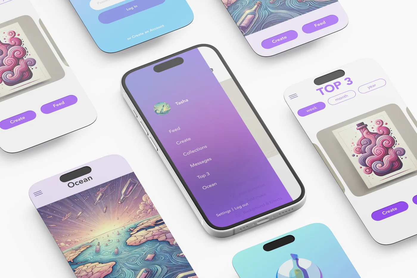
Bottle app — multiple iPhone screens floating on a soft gradient background
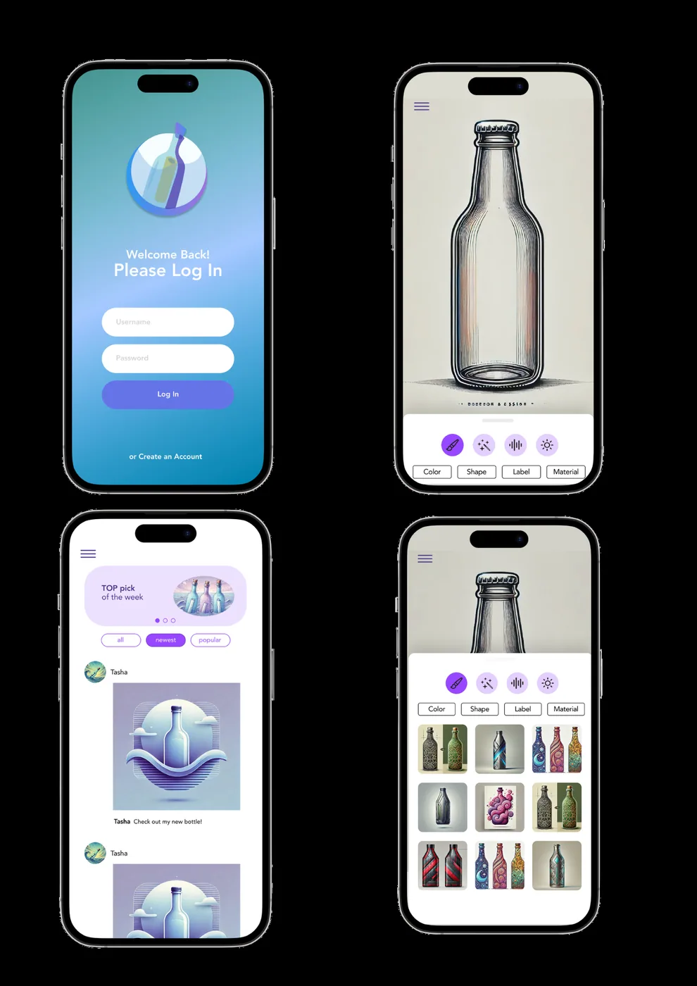
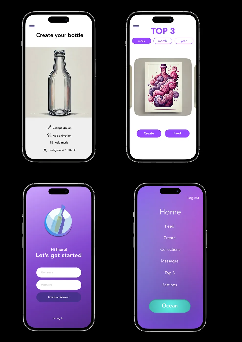
Bottle app prototype screens — onboarding, collections, top 3 and create-your-bottle flows
Prototype development — onboarding, feed, top 3, collections, create-your-bottle and the ocean view.
Web Prototype · Interactive

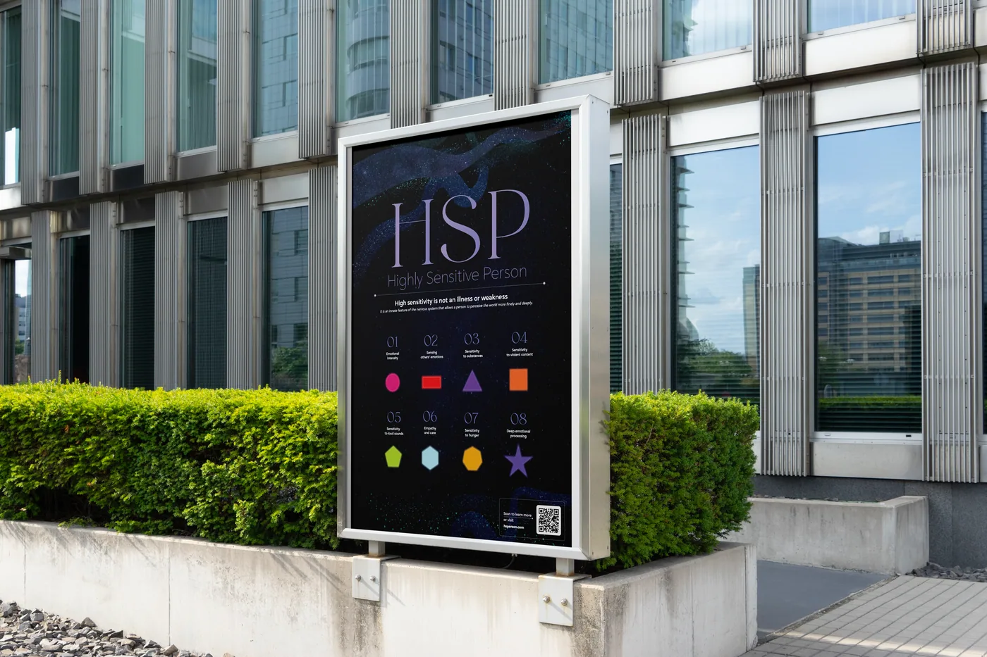
HSP — Highly Sensitive Person

Description

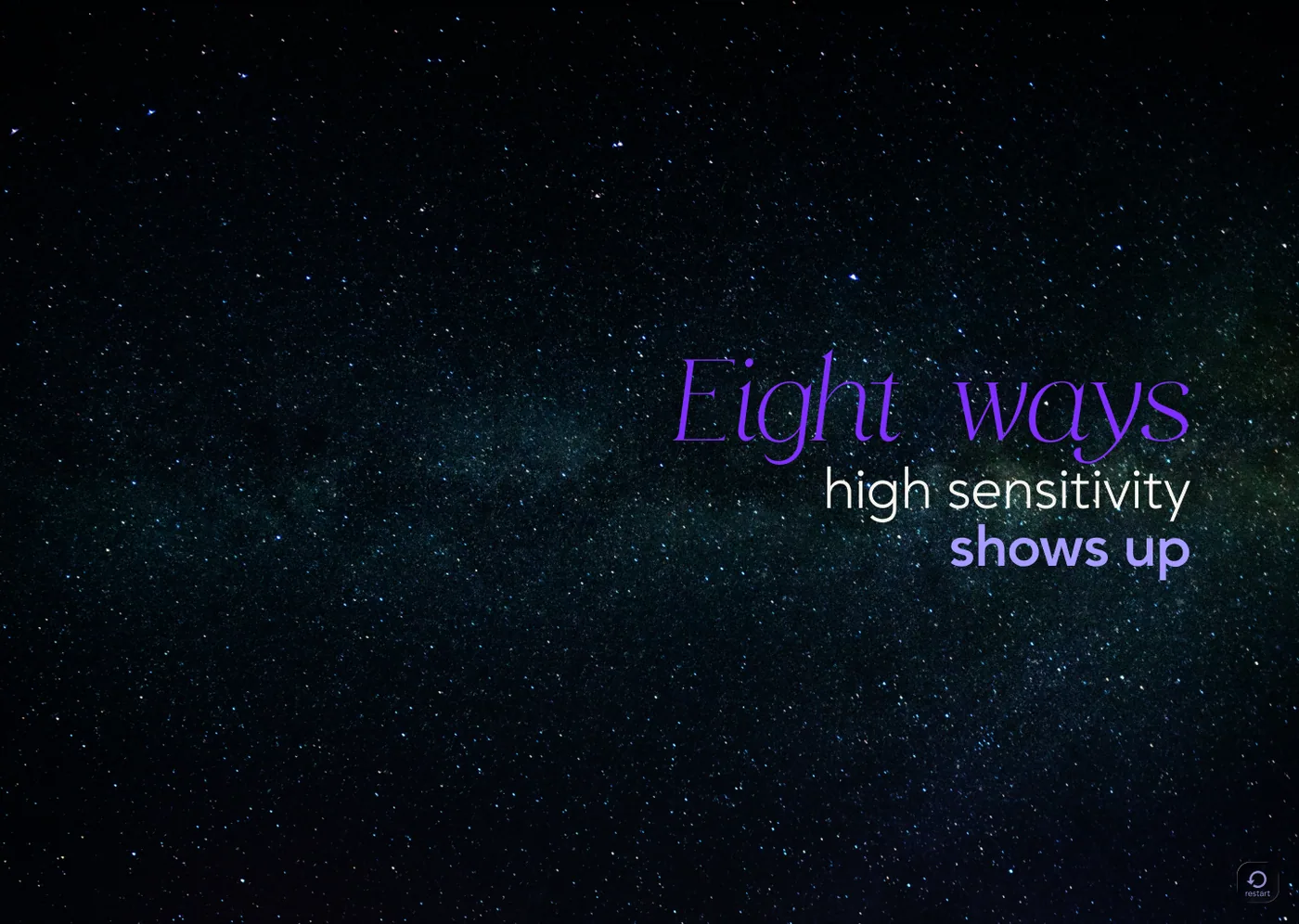
An interactive website prototype that turns the inner experience of a highly sensitive person into a visual, sensory journey. It explores emotional intensity, overstimulation, and the difficulty of explaining internal states through words alone.

Concept

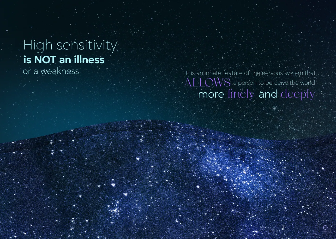
The website guides users through different aspects of High Sensitivity using motion, atmosphere, text and visual metaphors. Instead of only explaining what HSP is, the project helps the viewer feel the experience from the inside. Sensitivity is shown not as weakness, but as a form of deep perception and connection.

Prototype

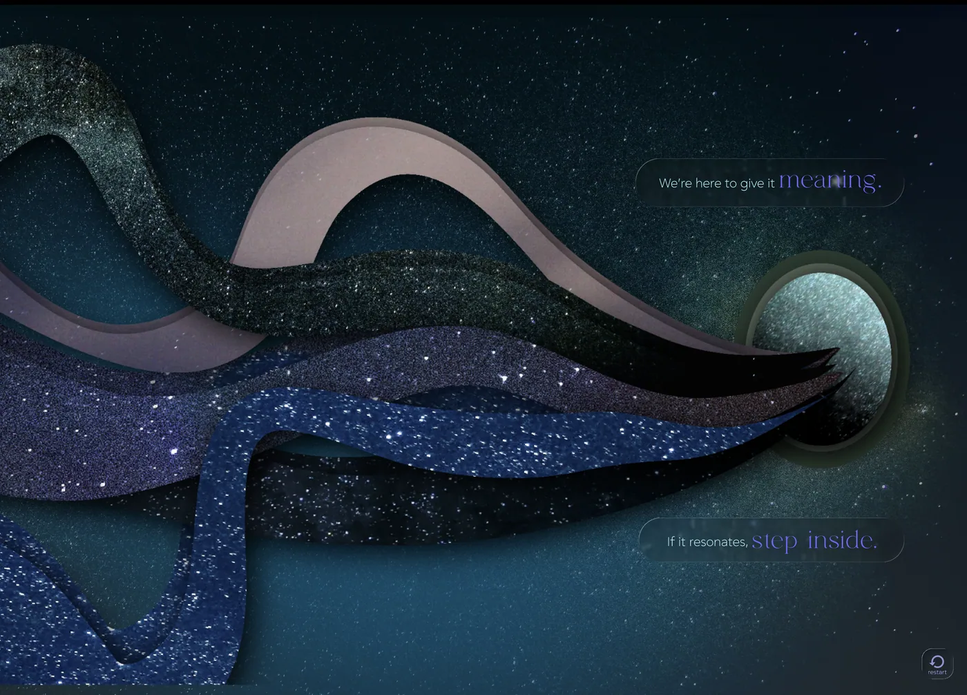
The universe became the metaphor for the depth of human inner experience — endless, layered, mysterious. Designed as an interactive parallax site so that movement and depth hold attention in a fast-scrolling world.

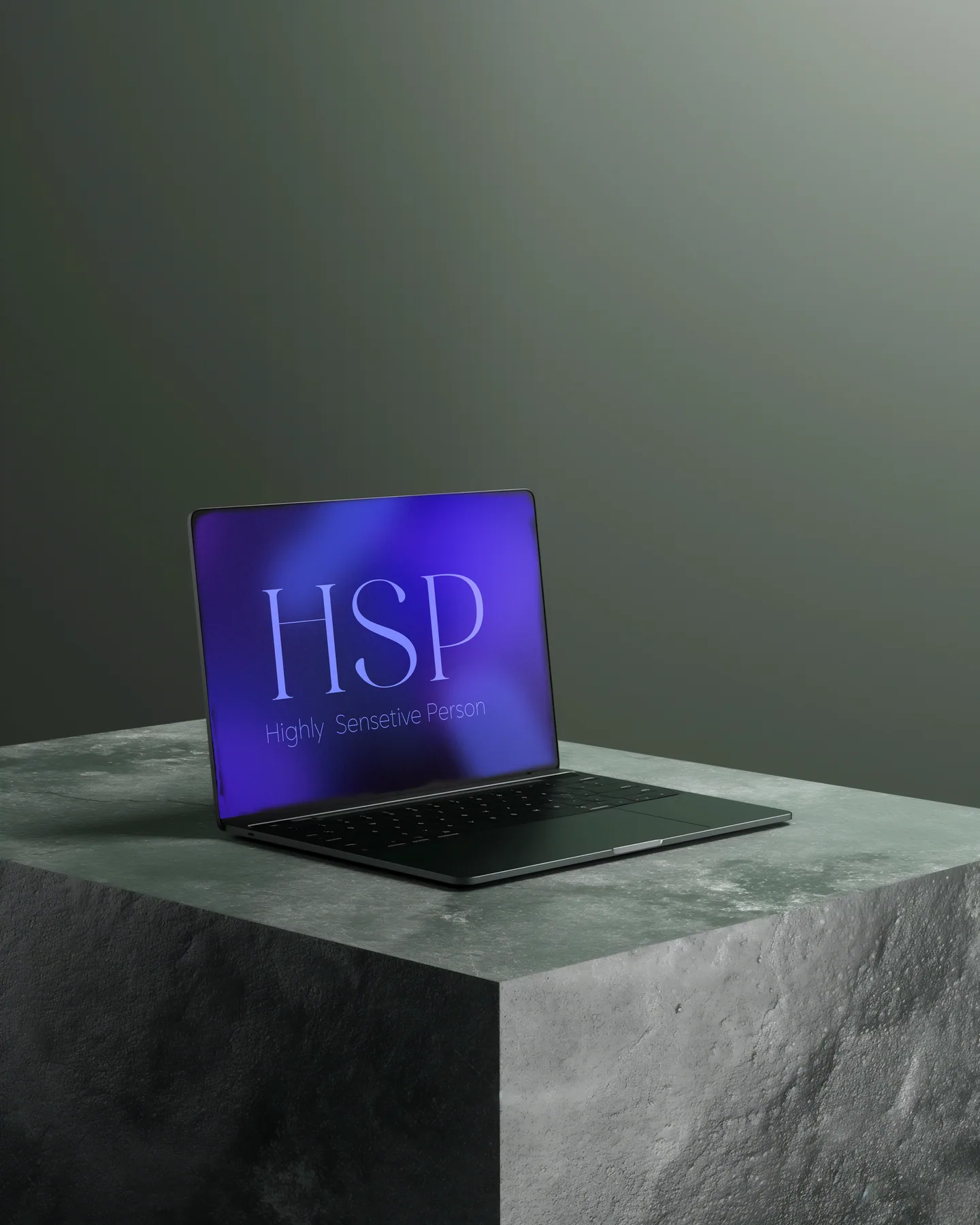
HSP project — laptop on stone pedestal showing HSP wordmark in dark teal
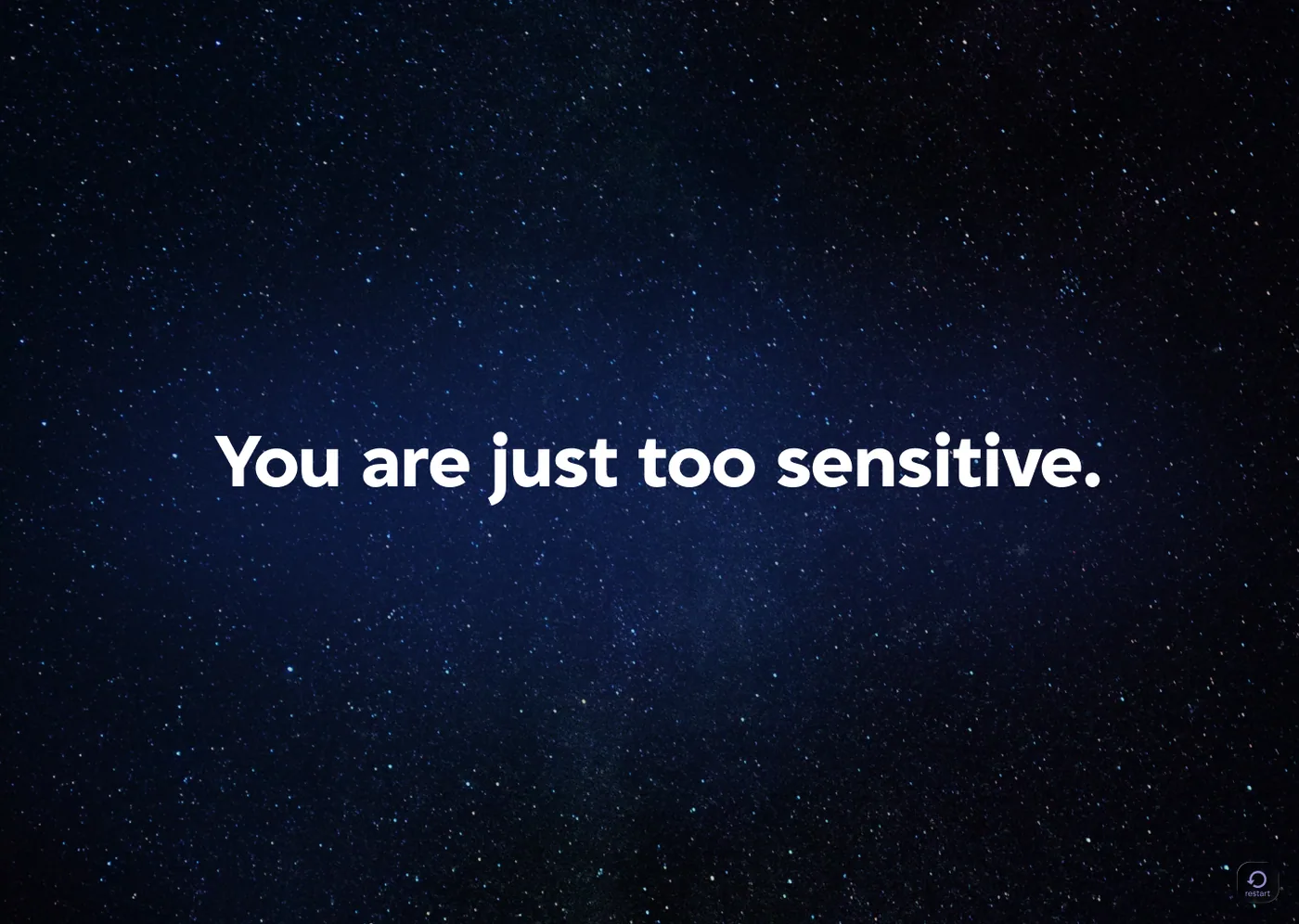
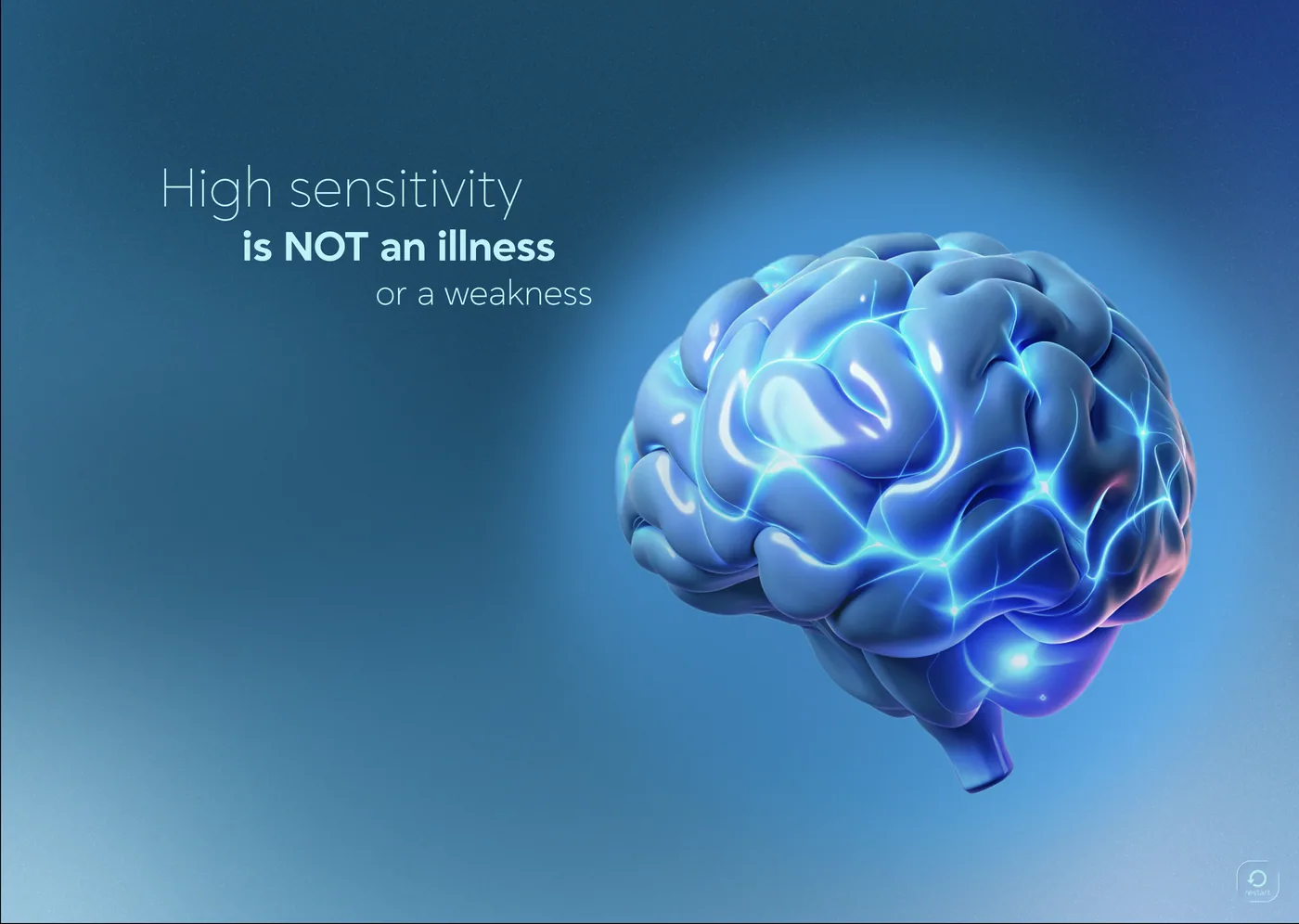
HSP interactive screens — outdoor billboard mockup and multiple laptop screens showing parallax scroll states
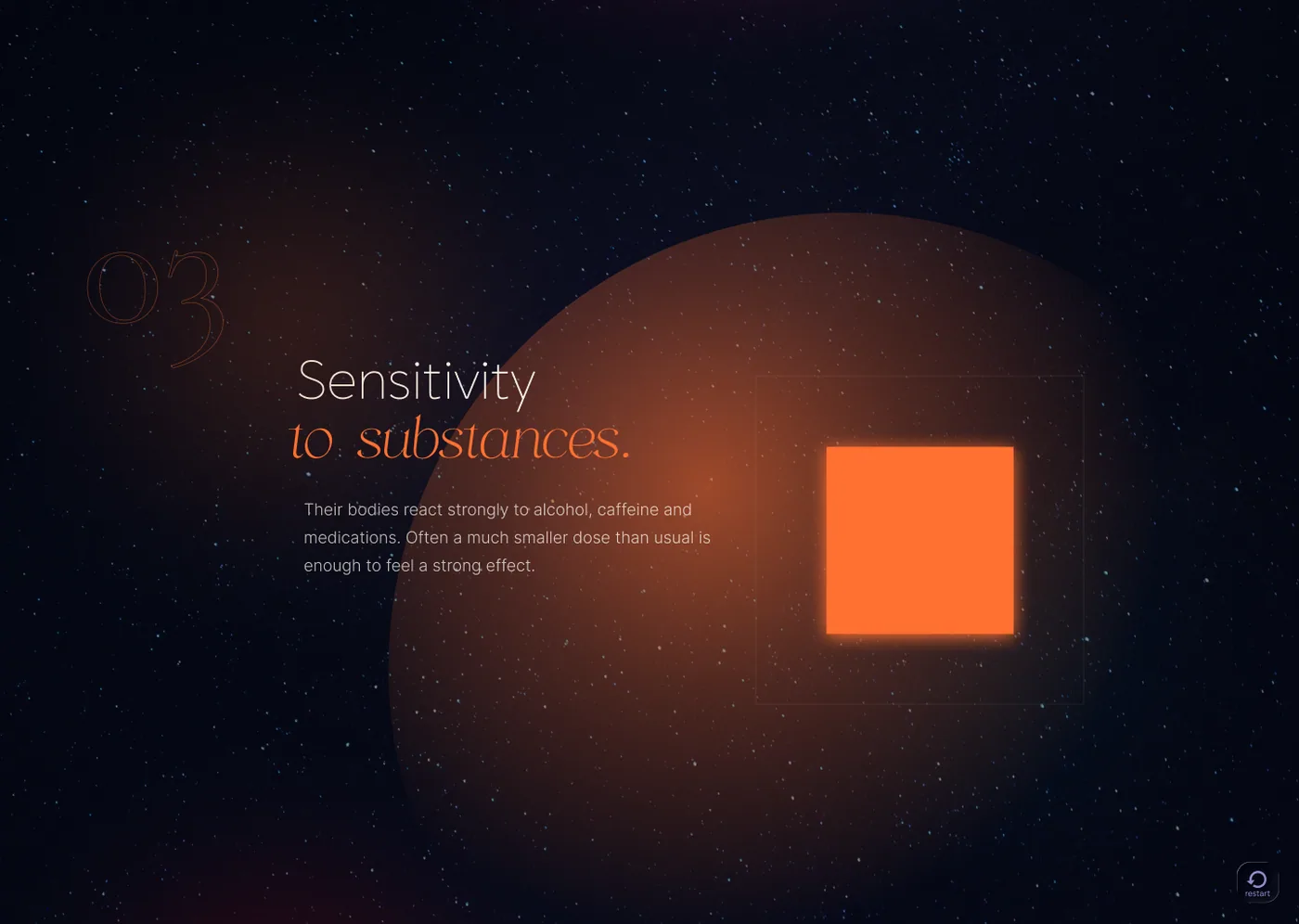
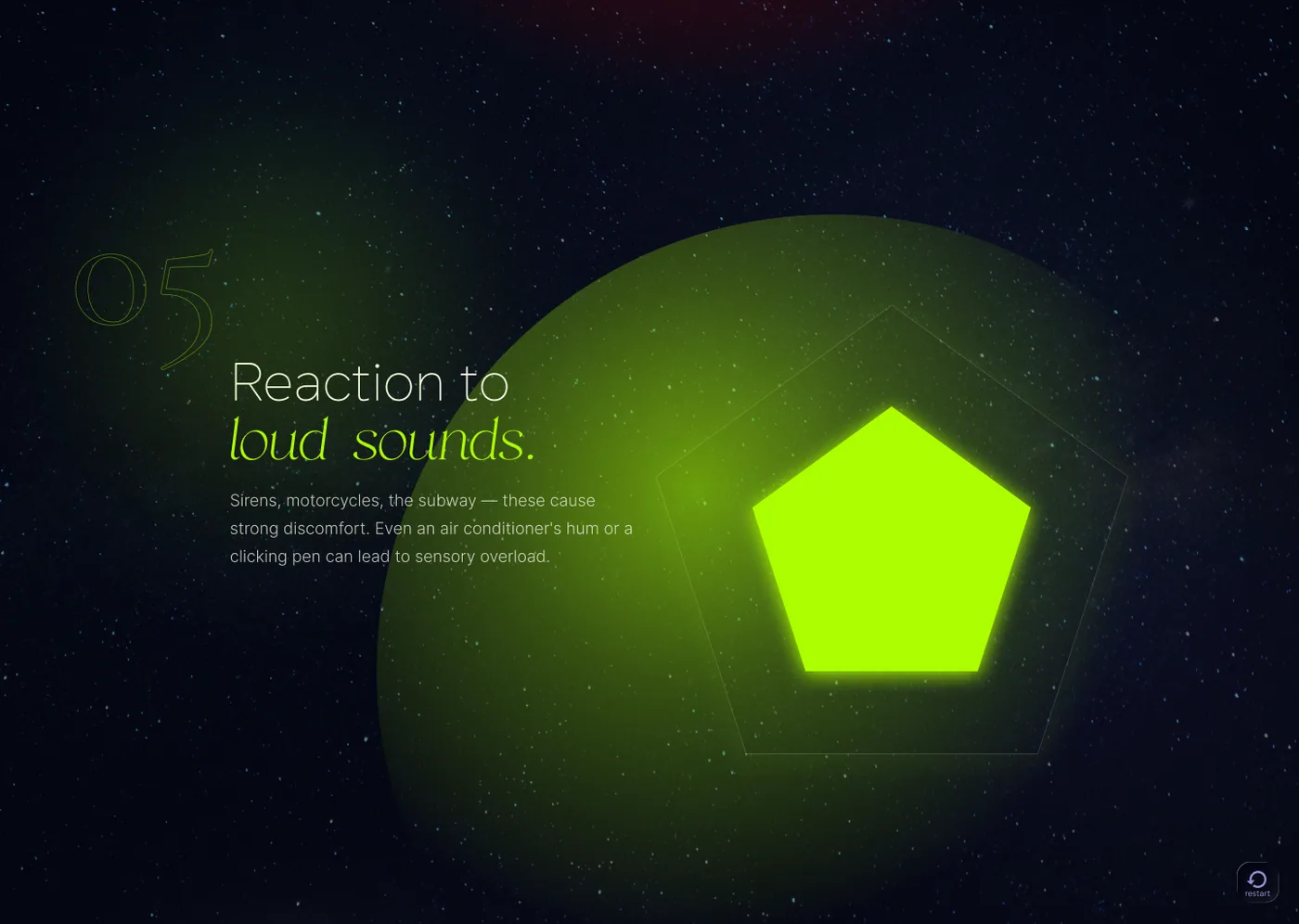
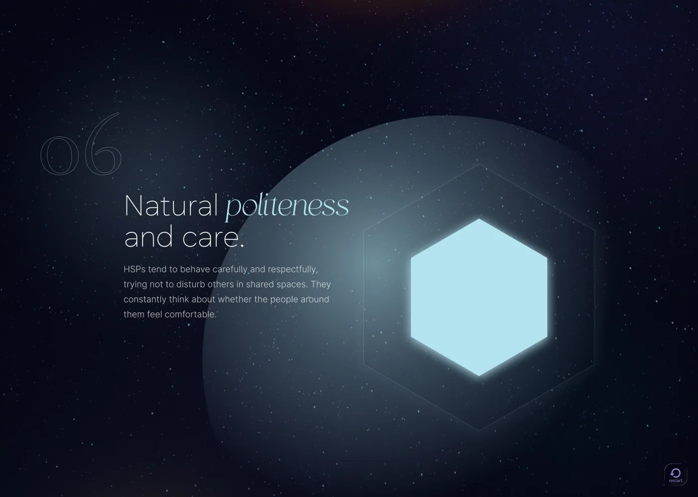
Scroll states — each section uses a coloured shape and a few words to evoke the feeling of overstimulation, intolerance to loud sounds, natural politeness, and emotional intensity.
04

Film & Marketing

Commercials, content, and short-form film — written, directed and shot.

Commercial · Brand

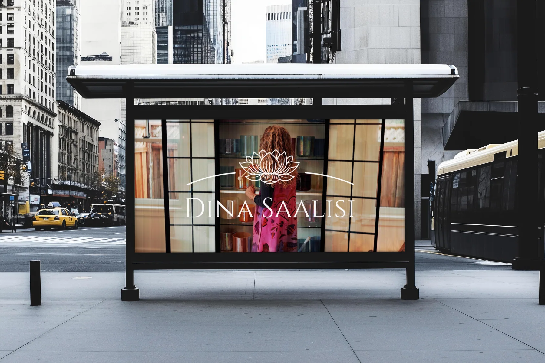
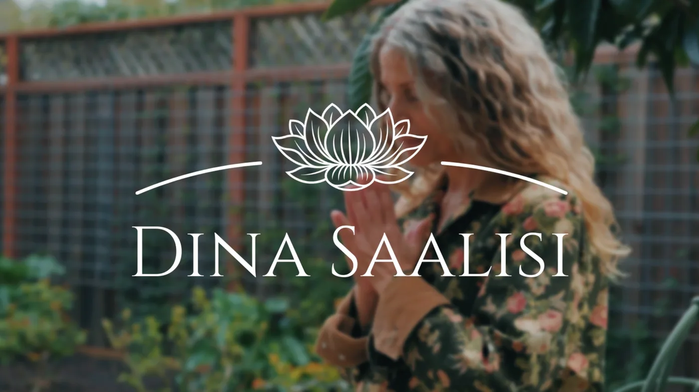
Dina Saalisi

Concept

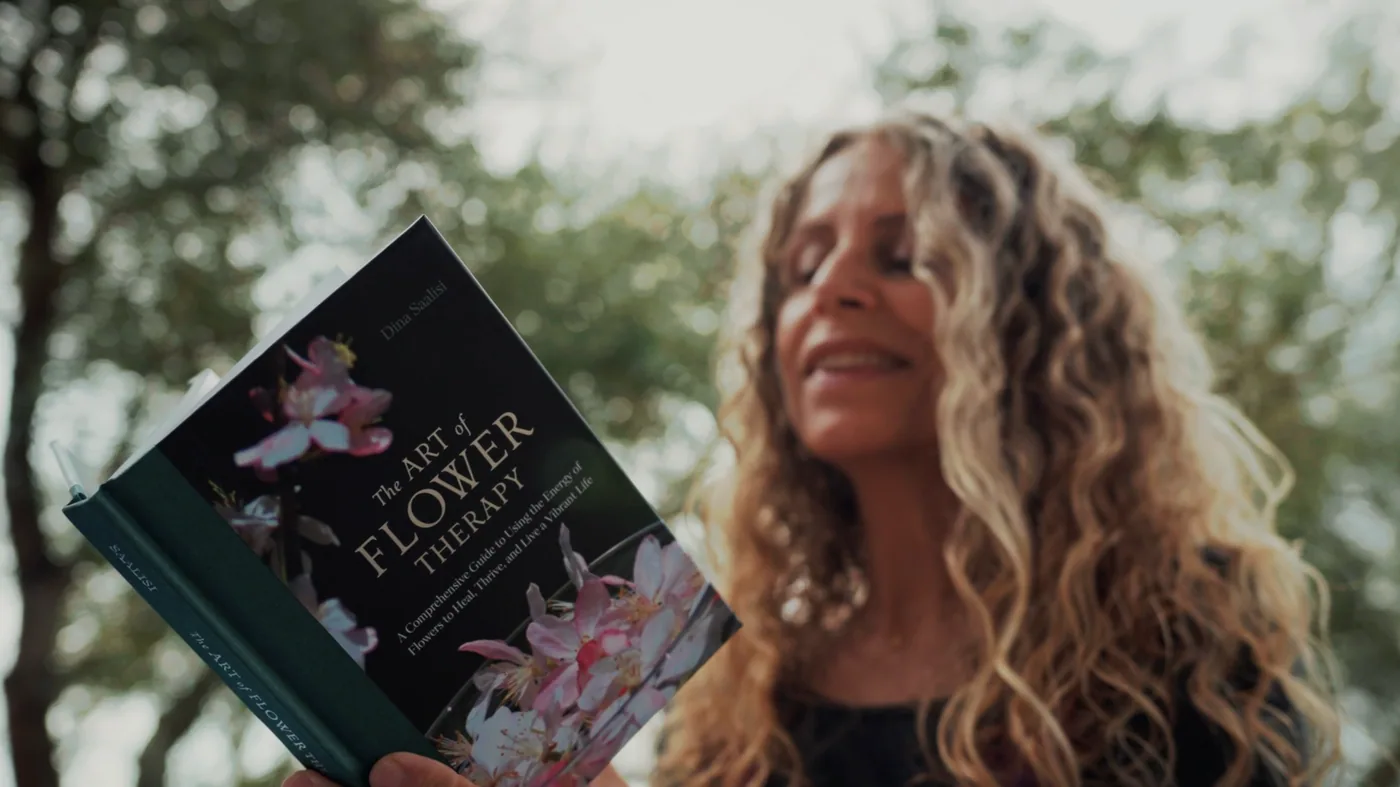
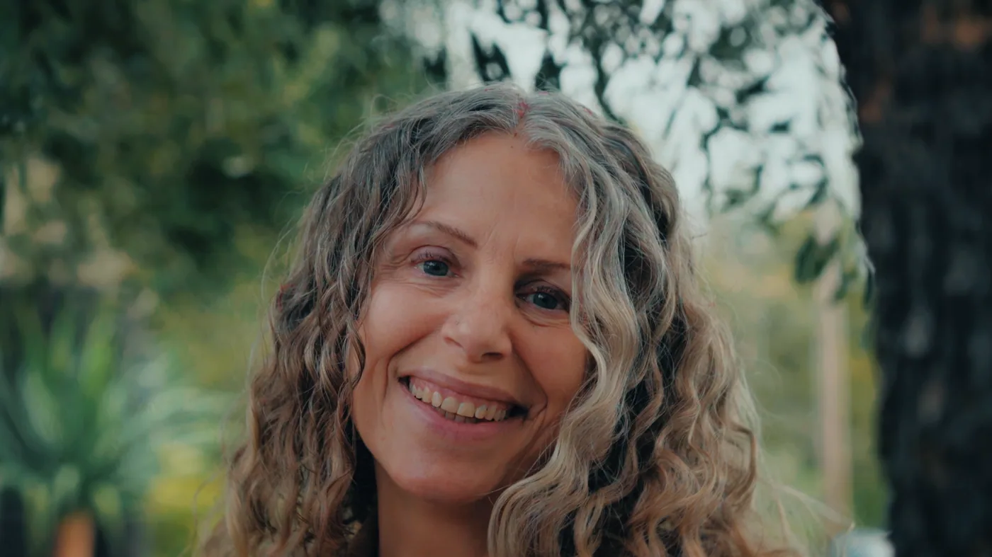
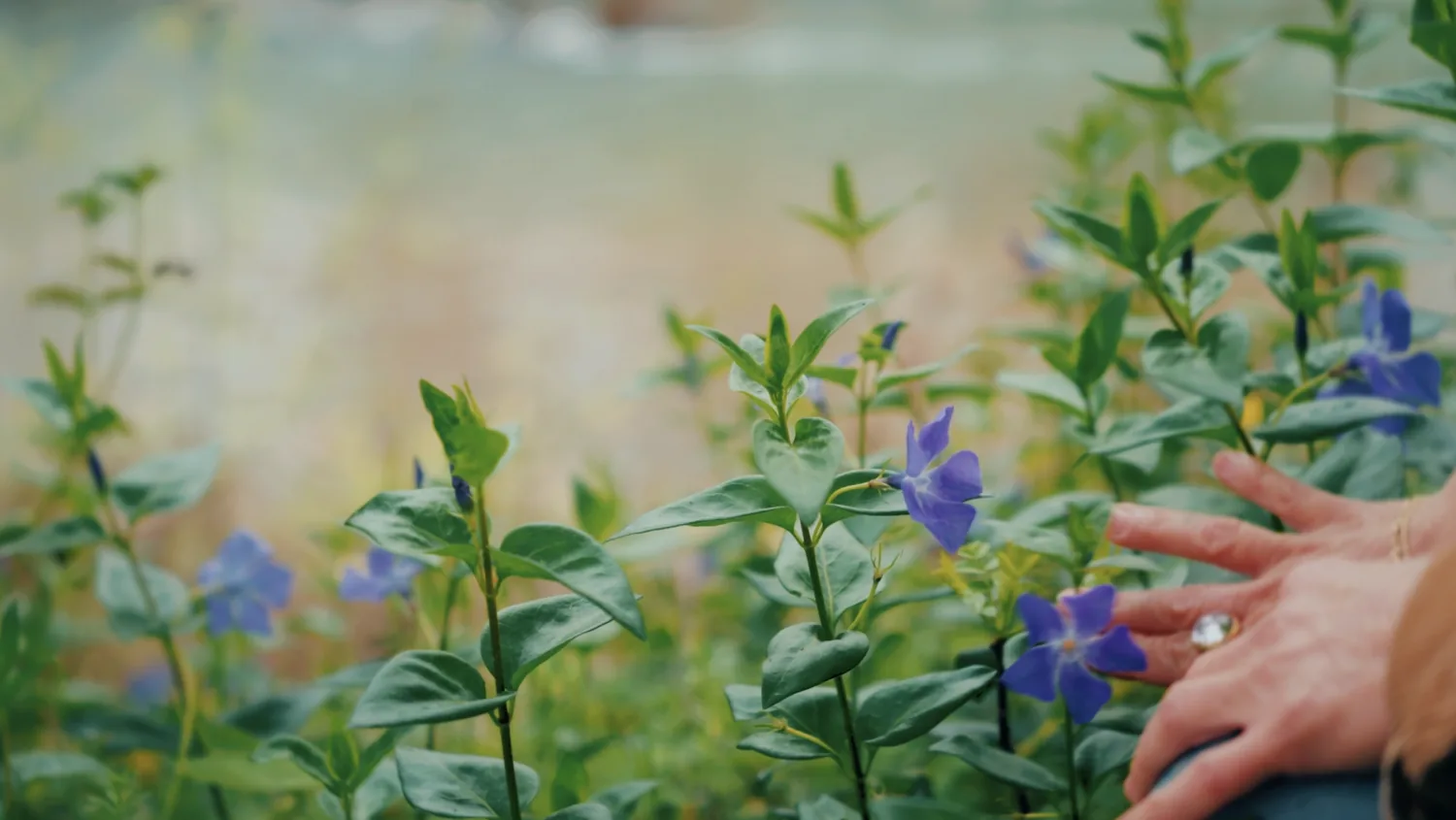
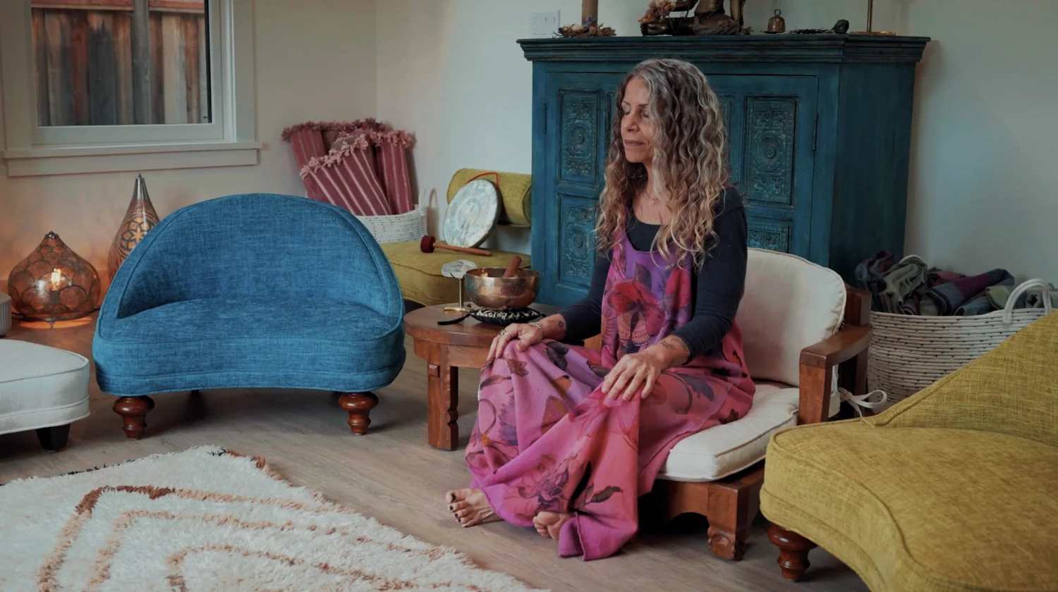
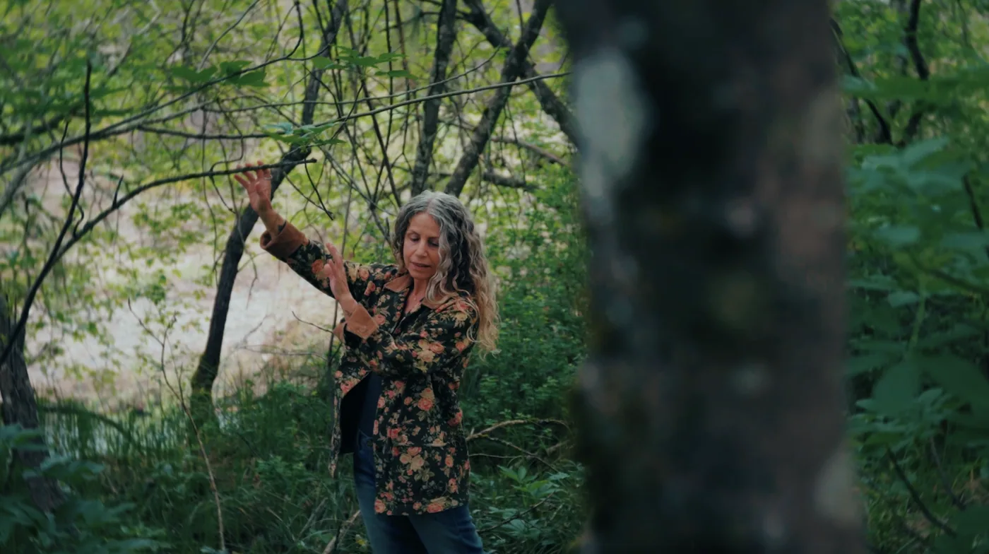
Two short commercial videos for Dina Saalisi: a brand spot and a product spot. A calm, natural and emotionally warm visual story that reflects the brand's connection to healing, nature and inner balance.

Process

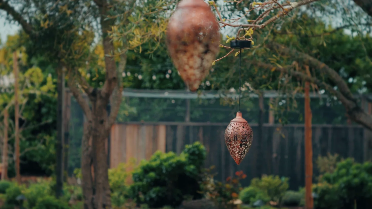
A big part of the process was working with natural textures, soft light, close-up details and quiet moments that help the viewer slow down and feel connected to the atmosphere of the brand. Special attention to sound design — gentle natural sounds and soft audio create a sense of presence, calmness and inner restoration.

Dina Saalisi commercial — billboard at a city bus stop with lotus logo and brand still
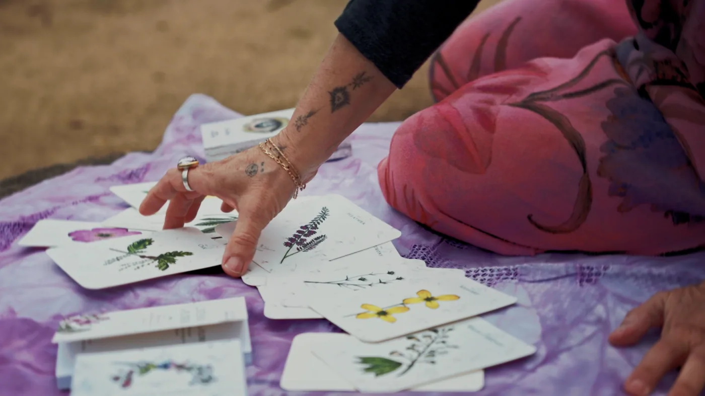
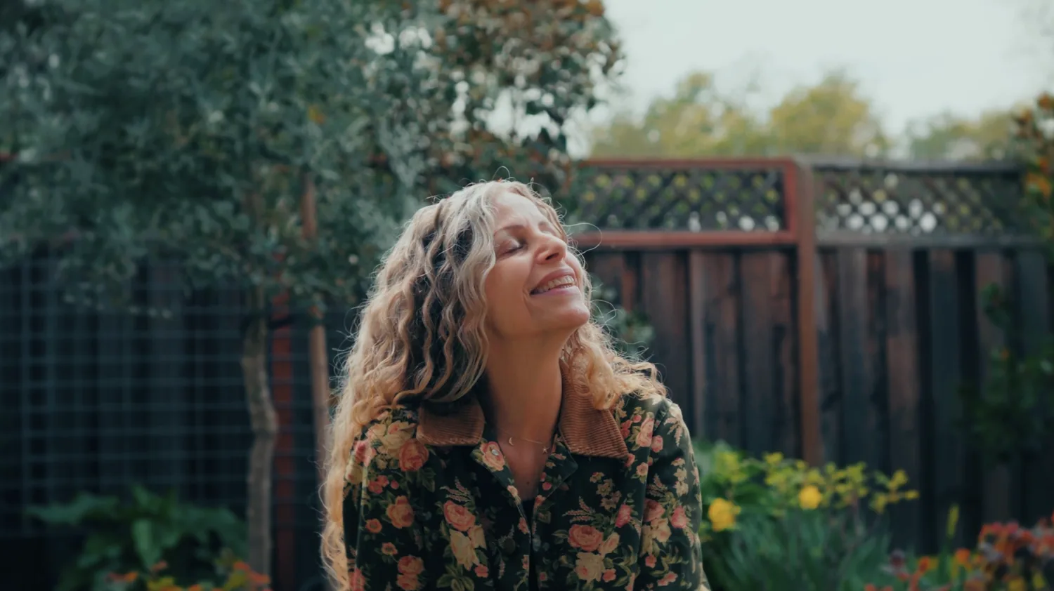
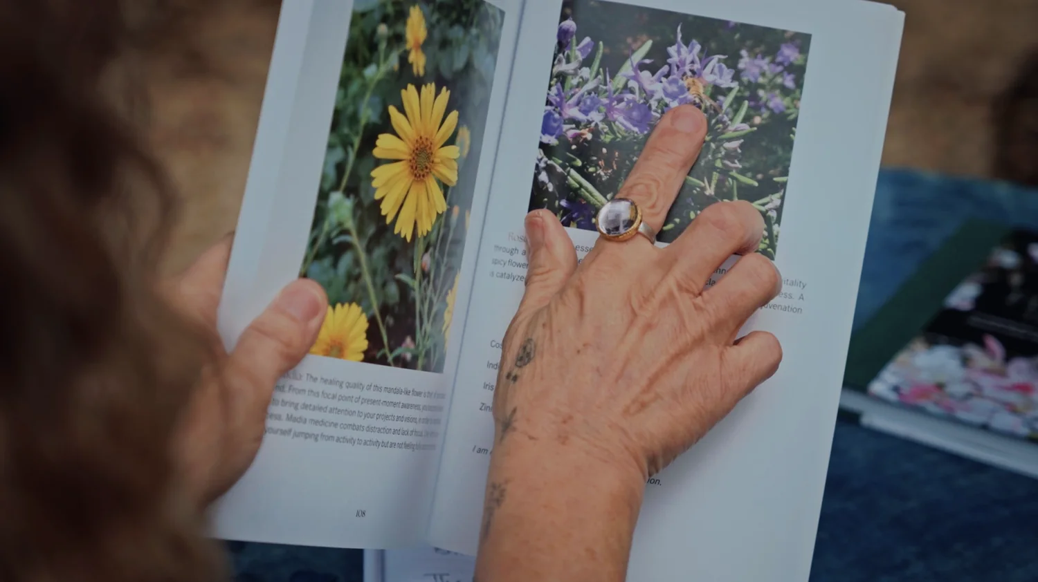
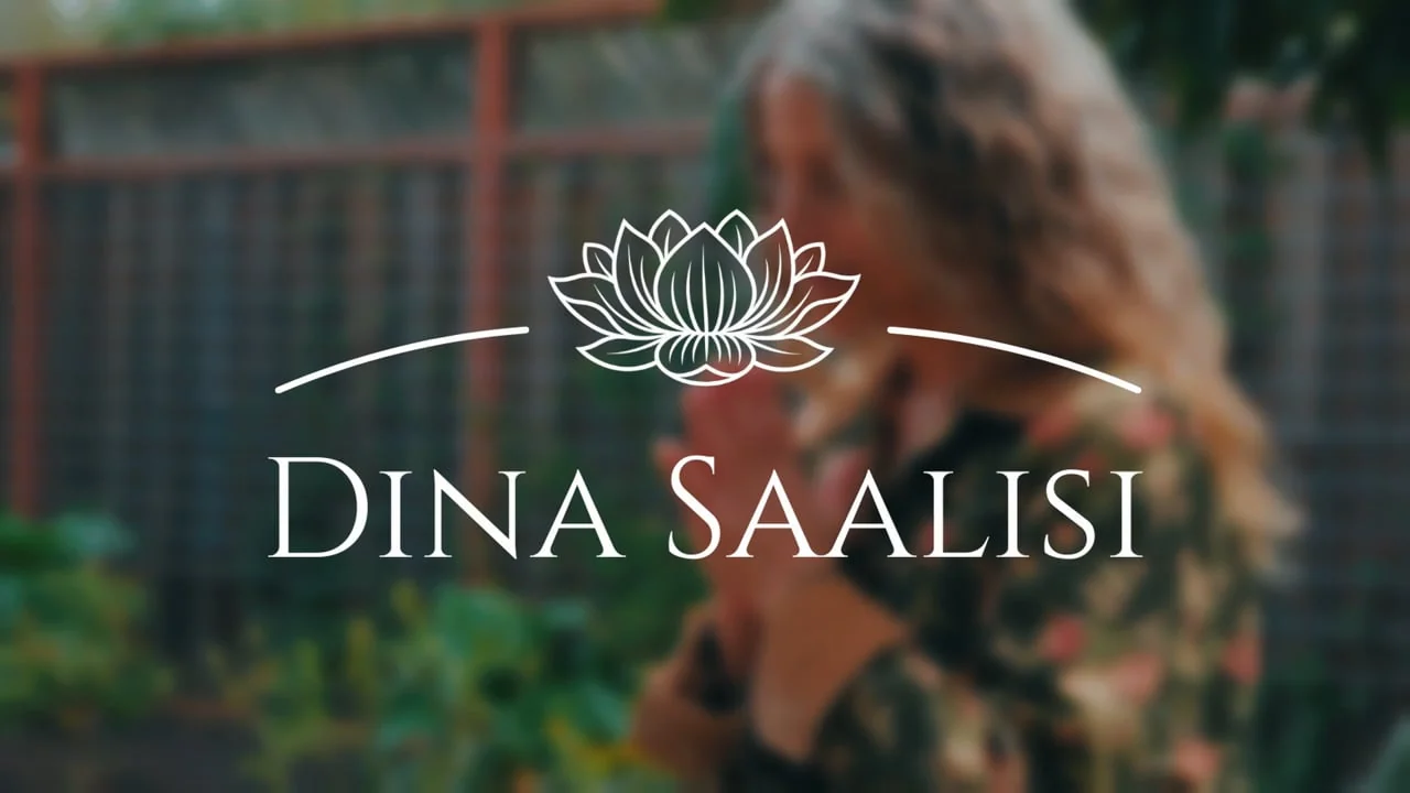
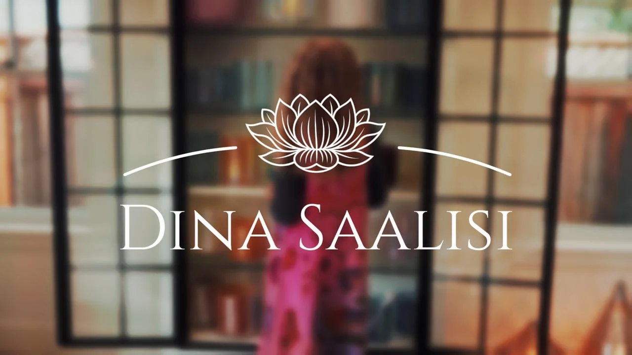
Dina Saalisi commercial stills — woman in garden, singing bowls, flower deck, natural textures
Stills from the brand & product commercial — nature, flowers, hands, sound bowls. The film is rooted in the natural world rather than a typical product ad.
Content · UGC · 70+ brands

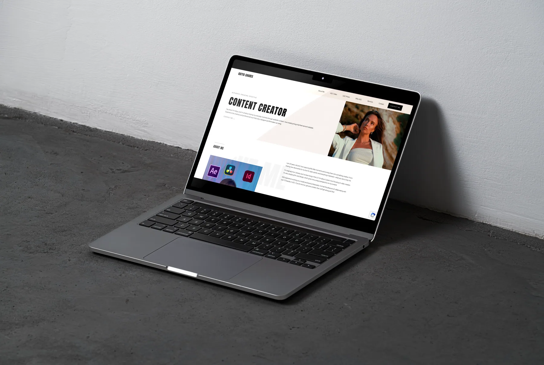
UGC — Content Creator

Description

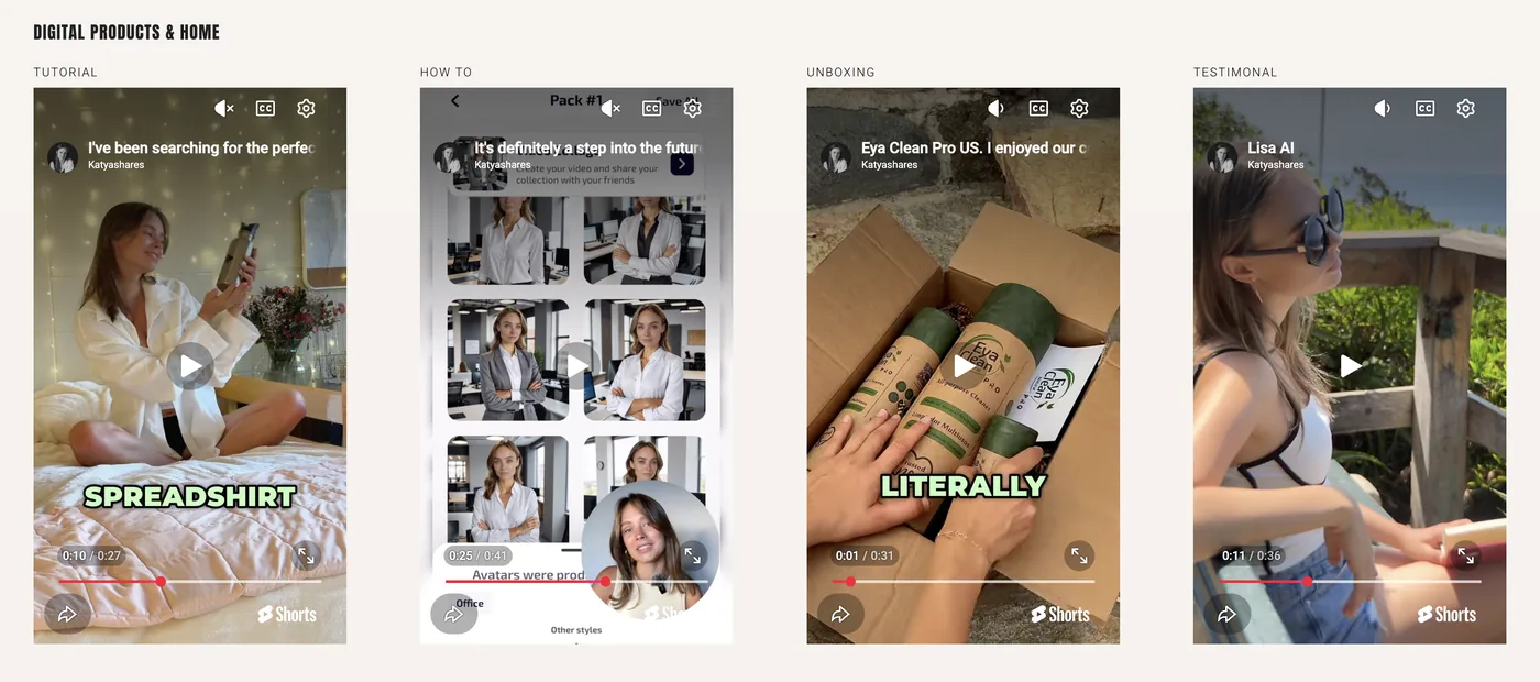
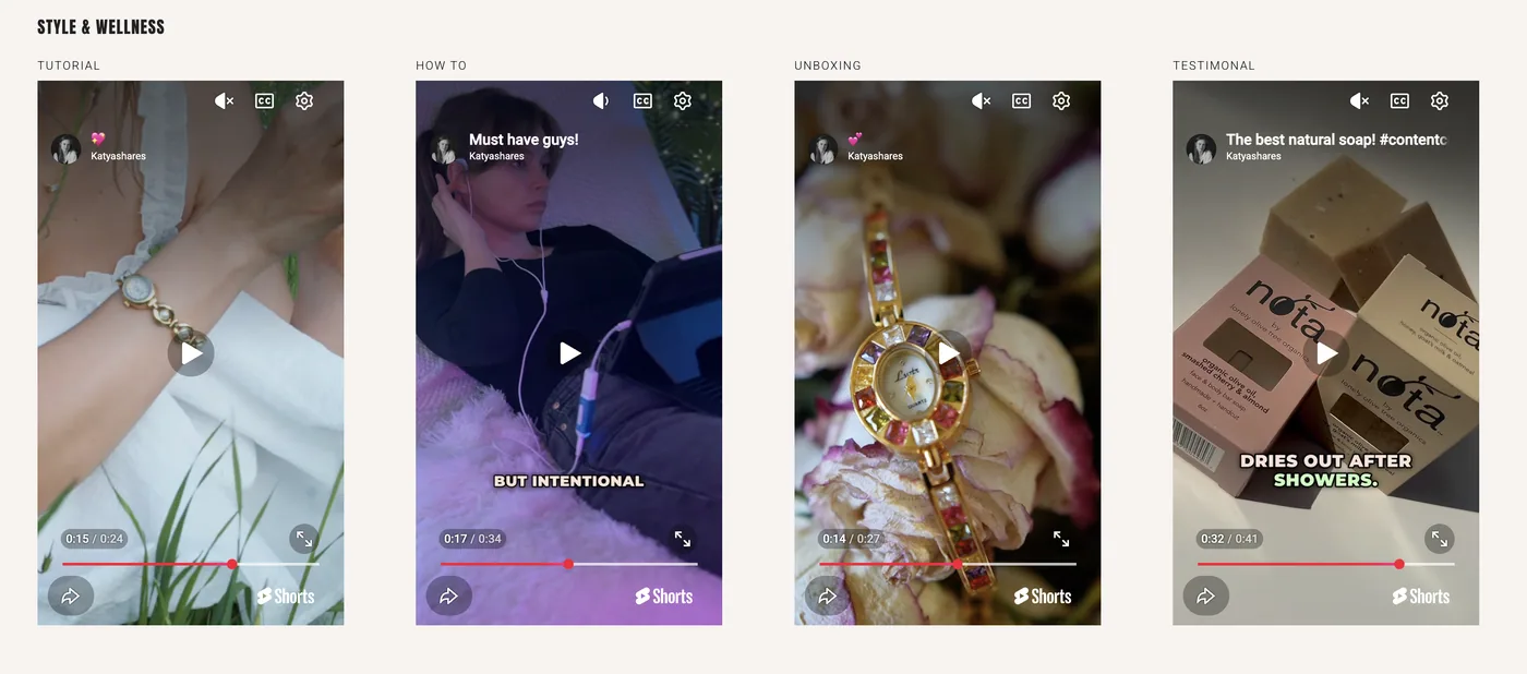
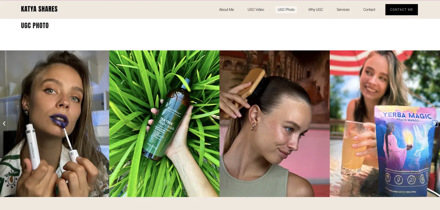
A personal portfolio site for content-creator and visual-storyteller work for brands. A big part is UGC — User-Generated Content: natural, relatable photo and video that feels authentic, personal and close to real customer experience.

Concept

Built after 70+ brand collaborations to make the process easier and more organised for clients. The site collects video and photo work, a video introduction, service options, and pricing.

UGC portfolio site shown on a laptop — Content Creator wordmark and bio
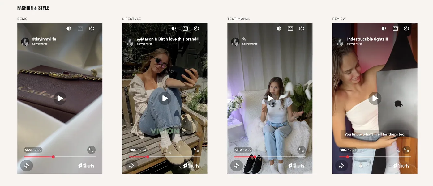
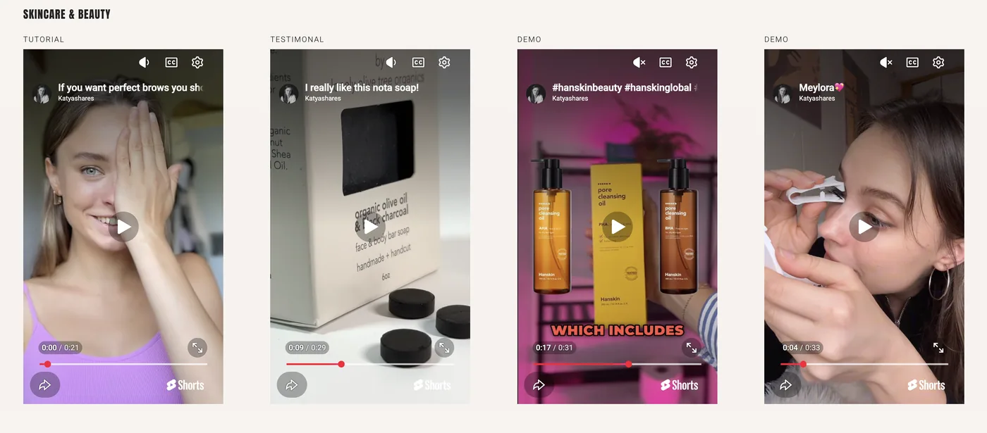
UGC reels — fashion, skincare, beauty, style, wellness, digital products grids
Categories — Fashion & Style, Skincare & Beauty, Style & Wellness, Digital Products. Every brief starts with brand, audience and message analysis.
Short Film · Writer · Director · Producer

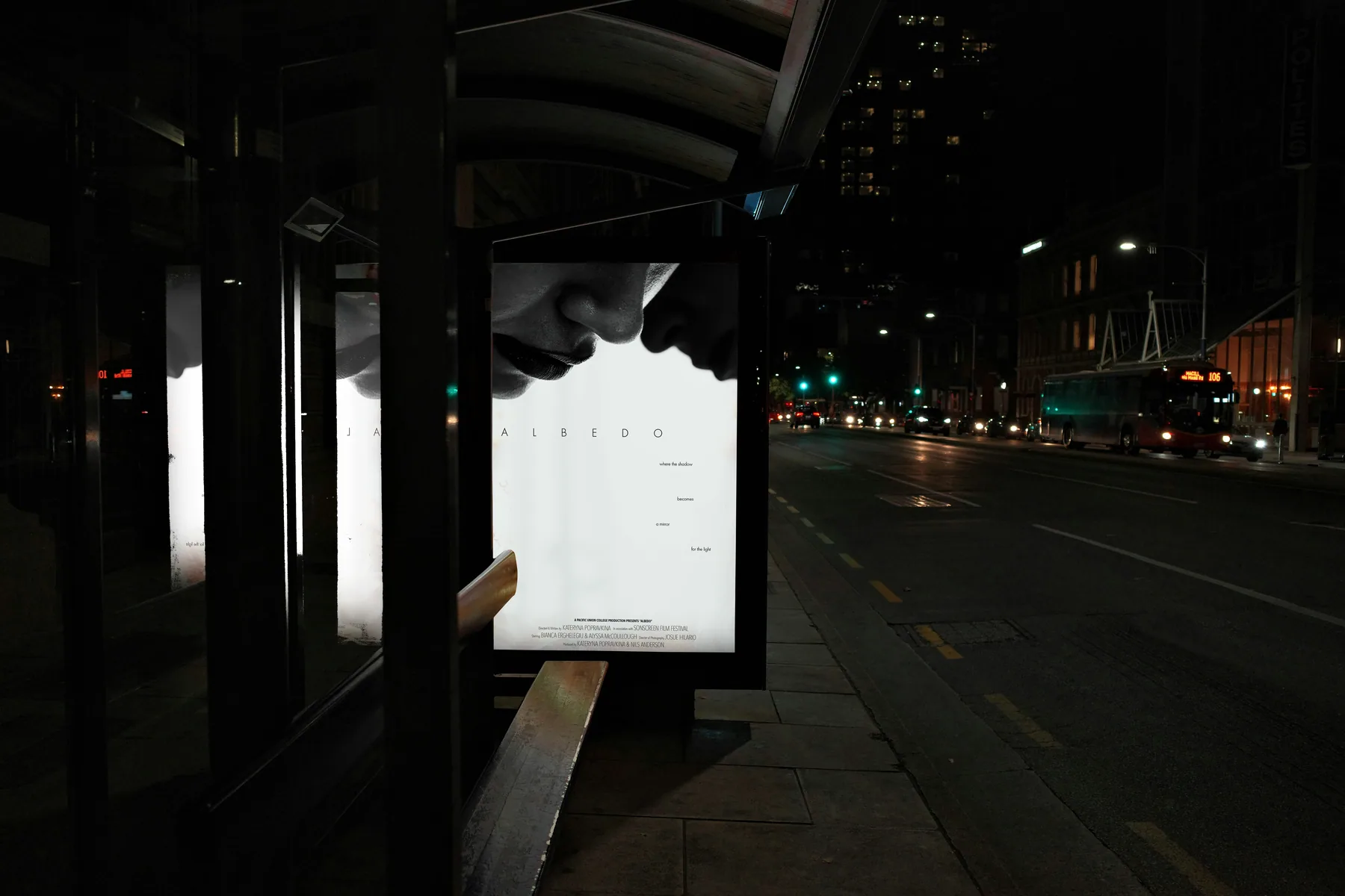
Albedo

Description

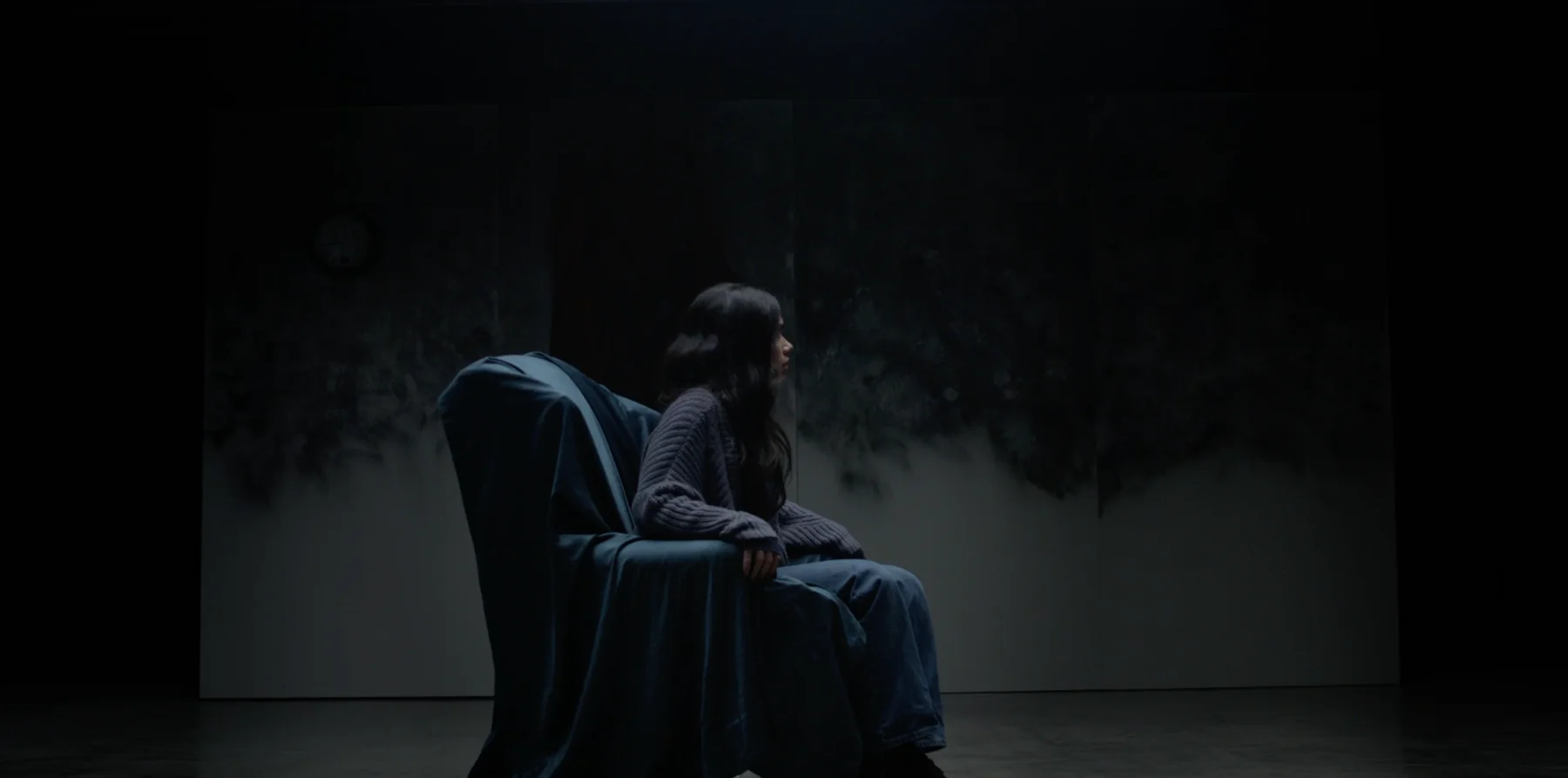
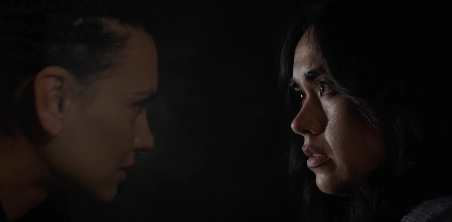
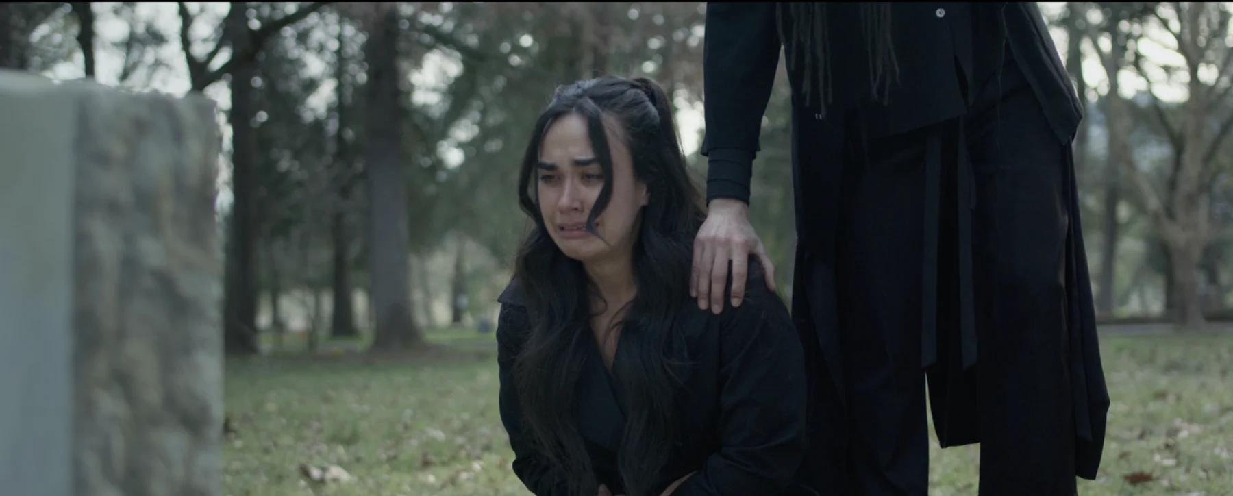
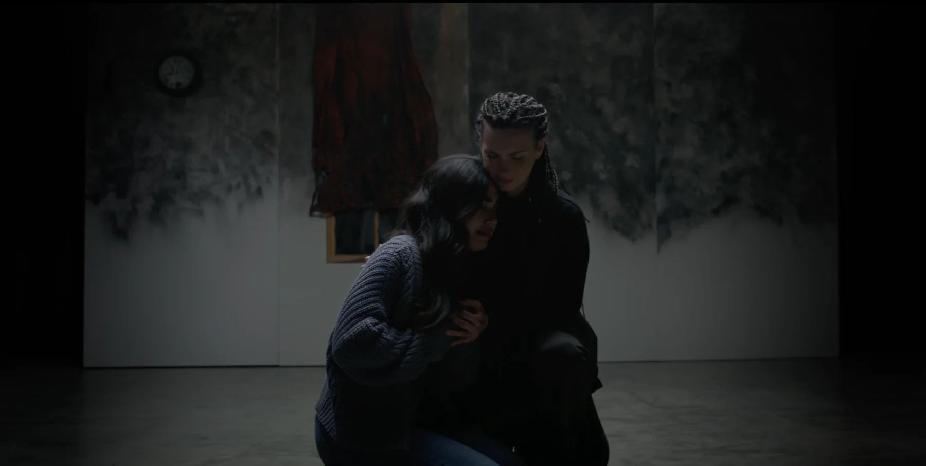
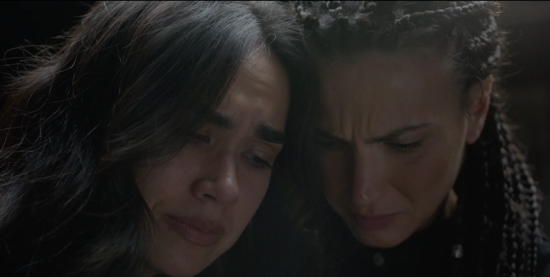
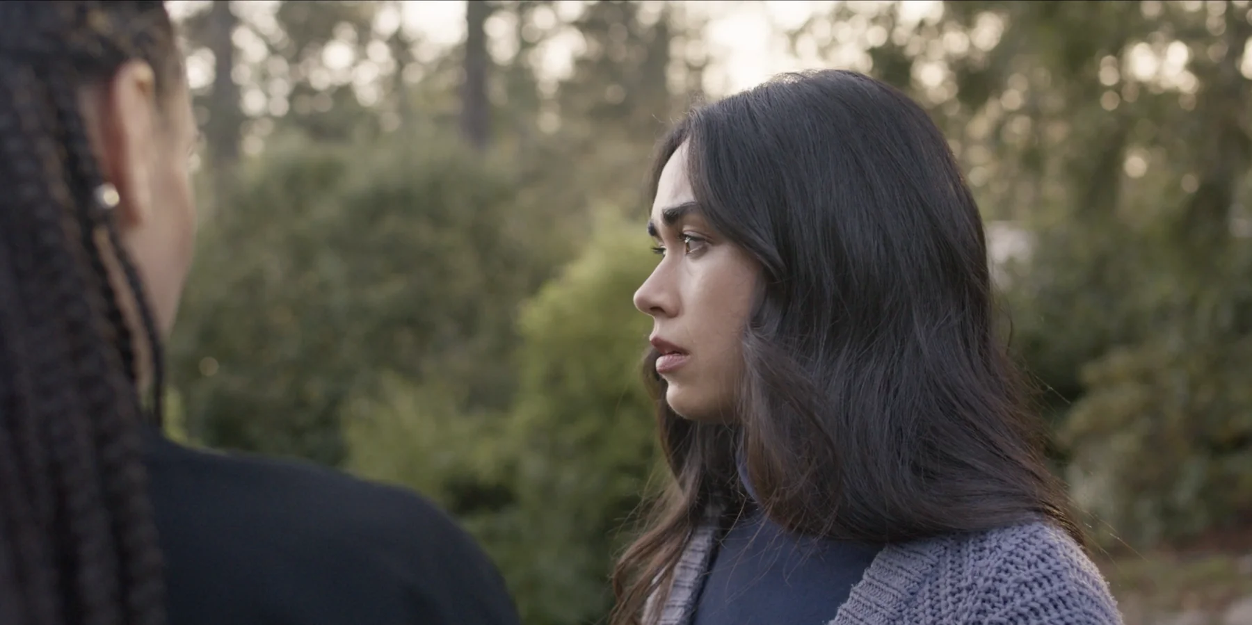
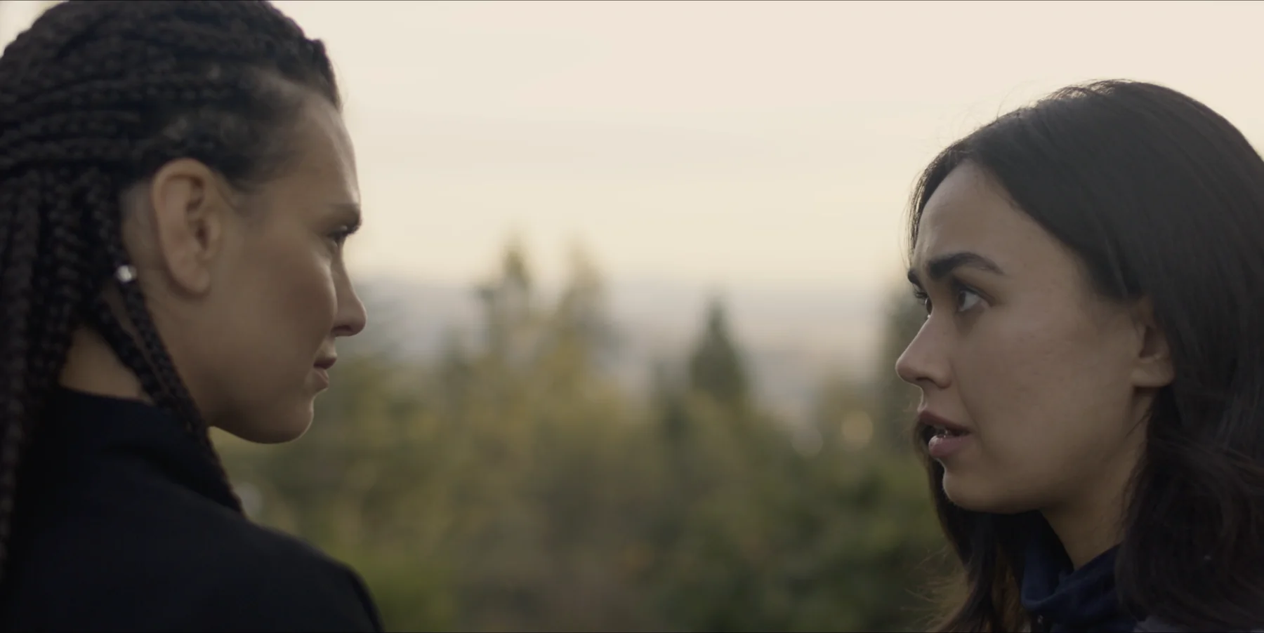
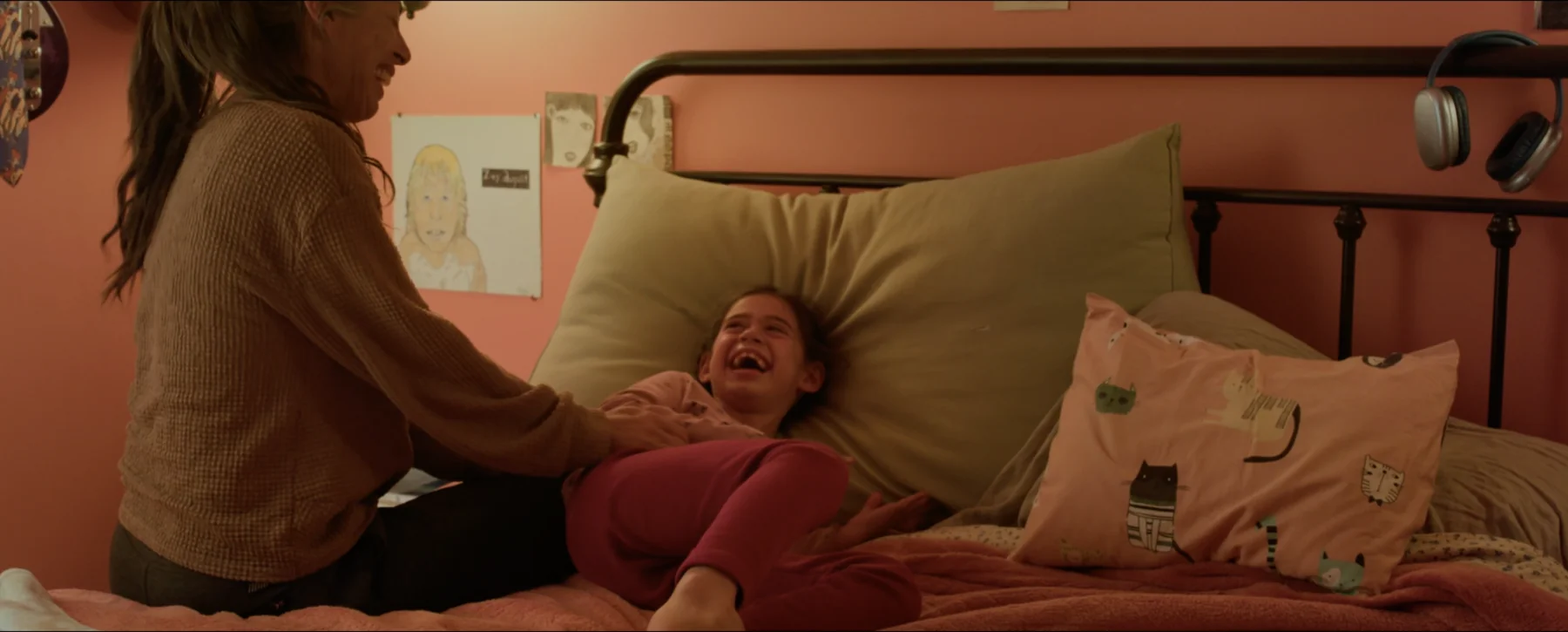
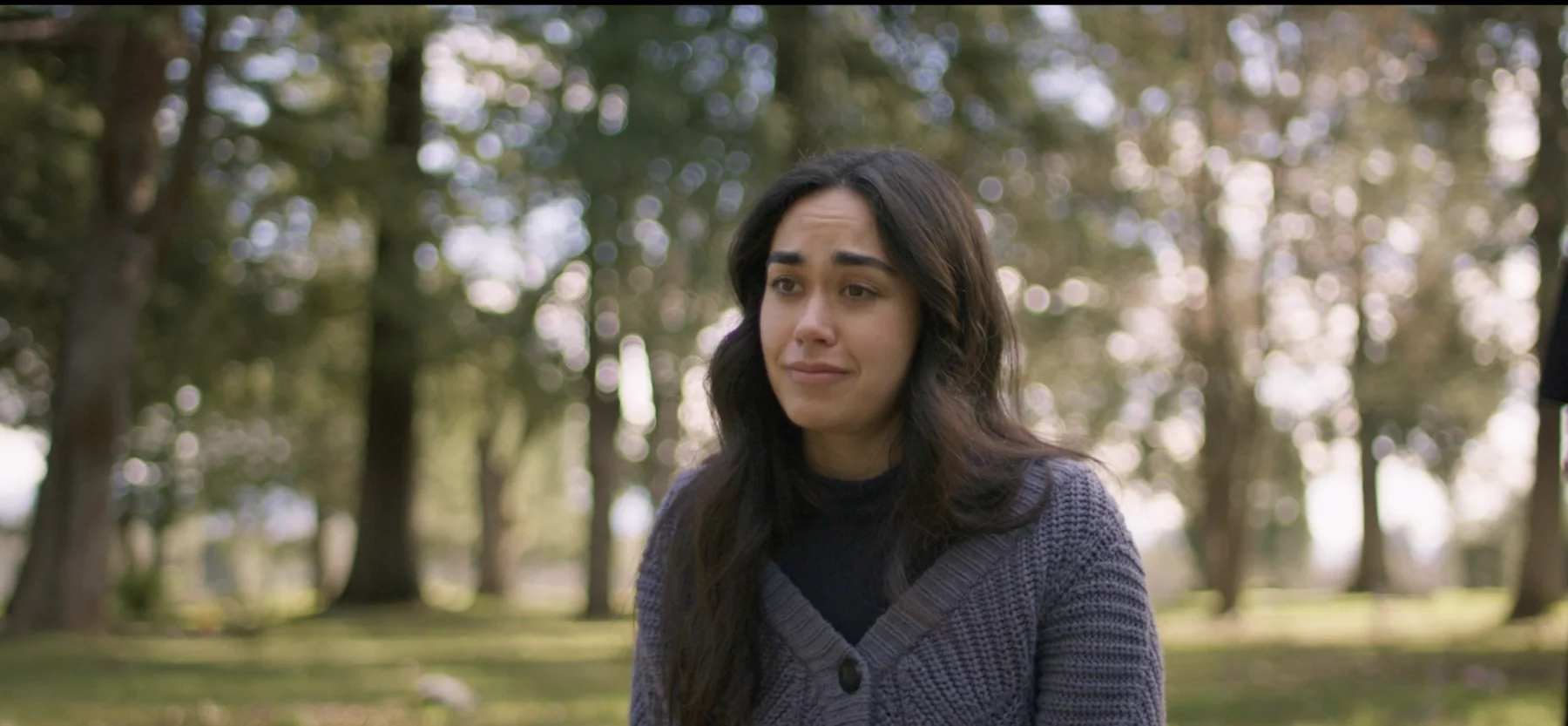
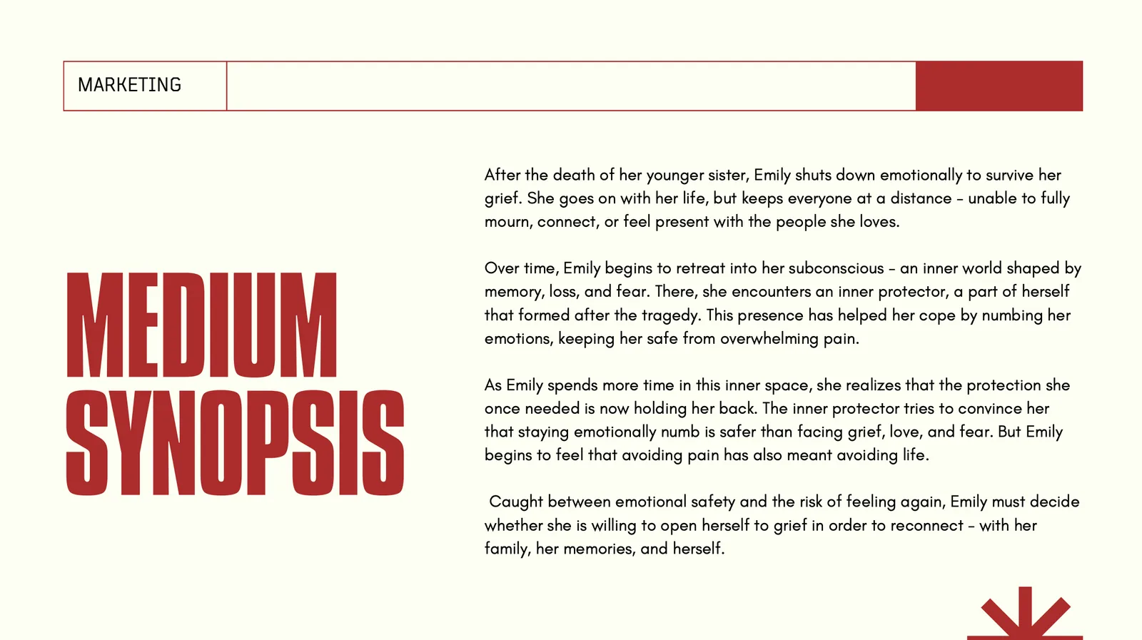
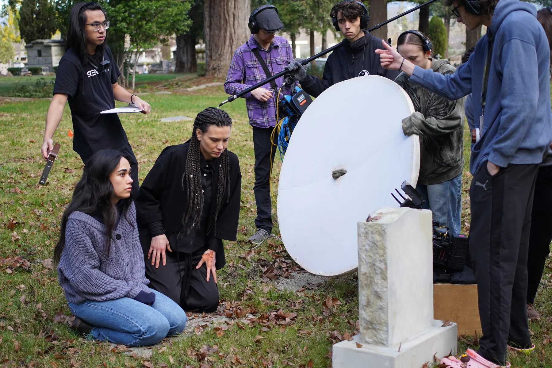
A psychological short film about grief, trauma, emotional numbness, and the inner parts of ourselves that try to protect us from pain. Emily, a young woman, shuts down emotionally after the death of her younger sister and enters her subconscious, where she meets an inner protector that once helped her survive but now keeps her disconnected from life.

Concept

I developed the story from its original personal concept into a completed short film. Through its dark atmosphere, intimate imagery and subconscious setting, Albedo presents healing as the beginning of awareness and emotional reconnection.

Process

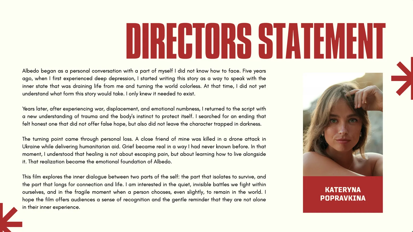
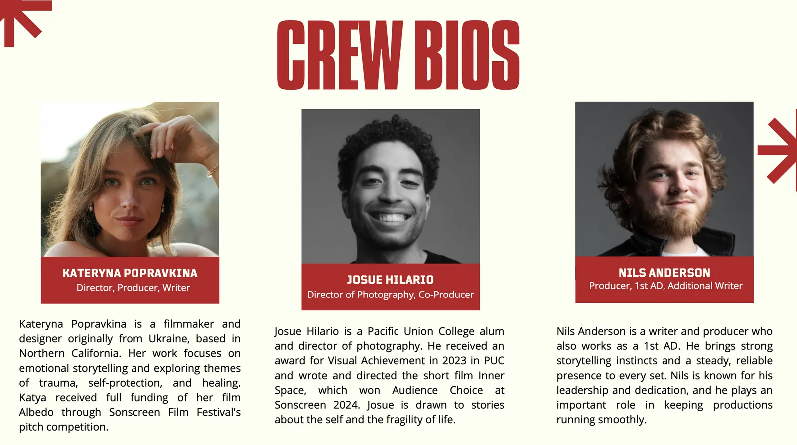
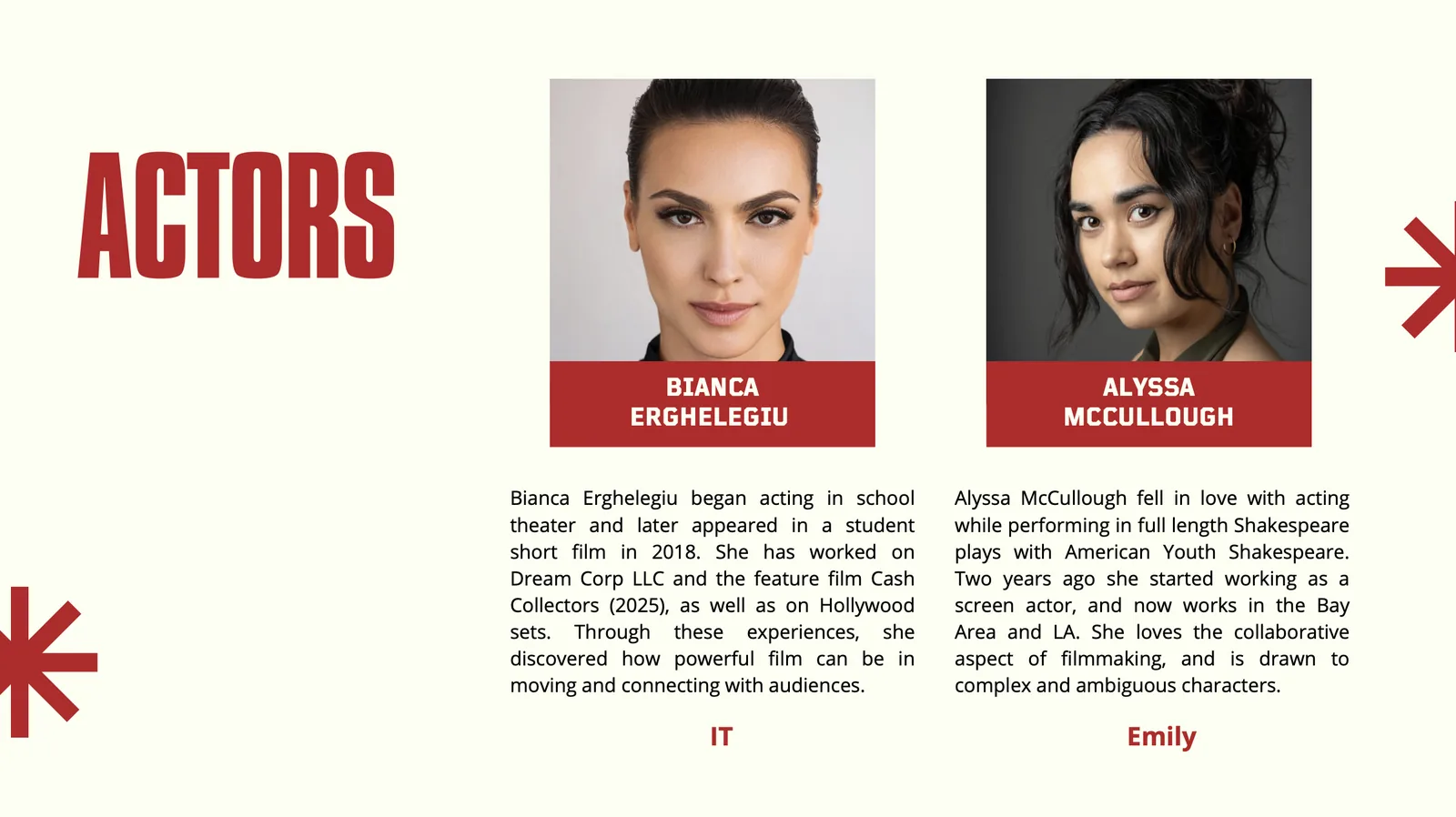
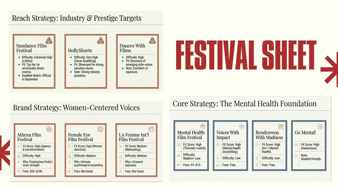
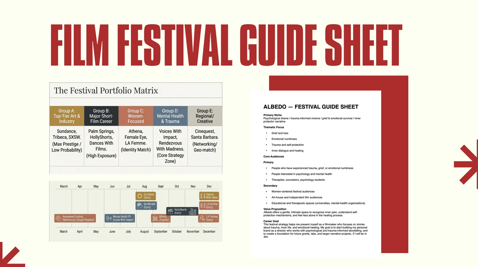
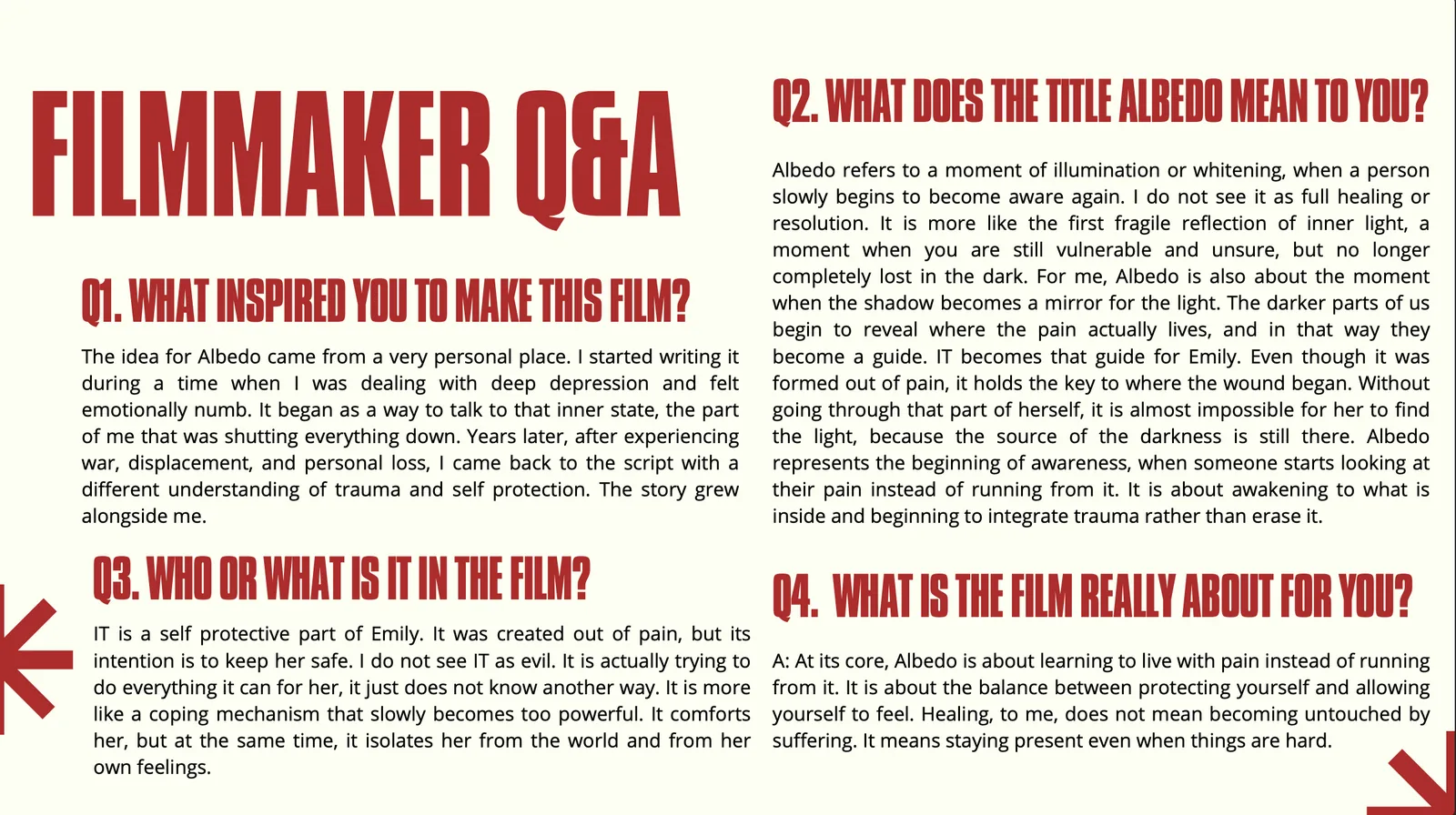
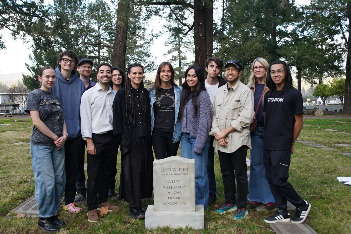
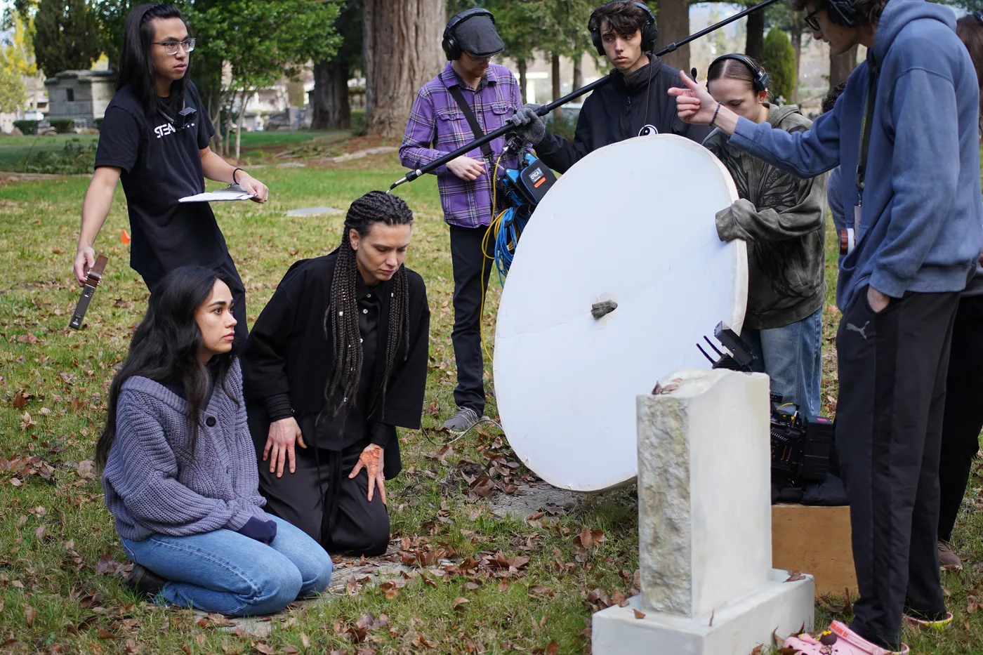
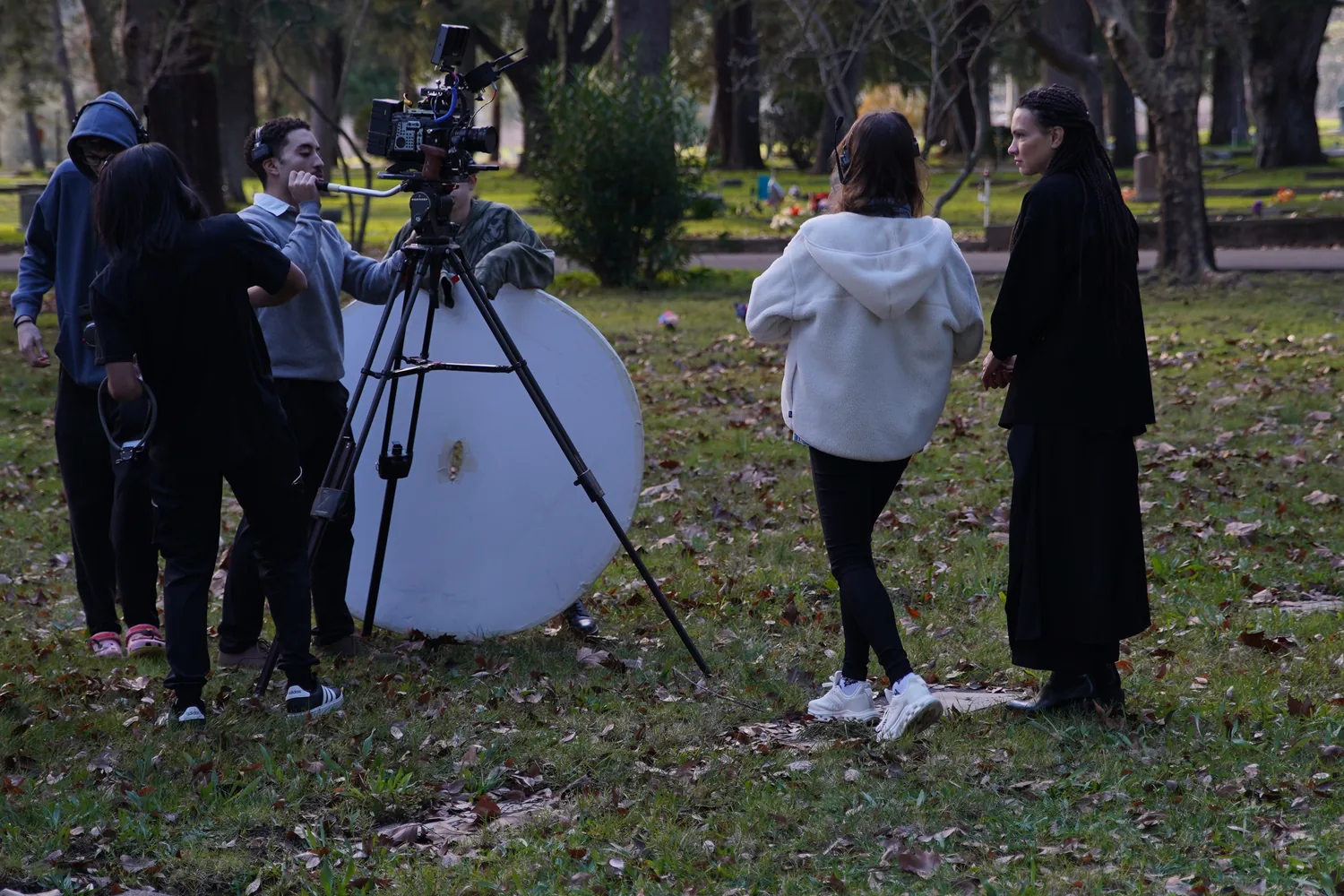
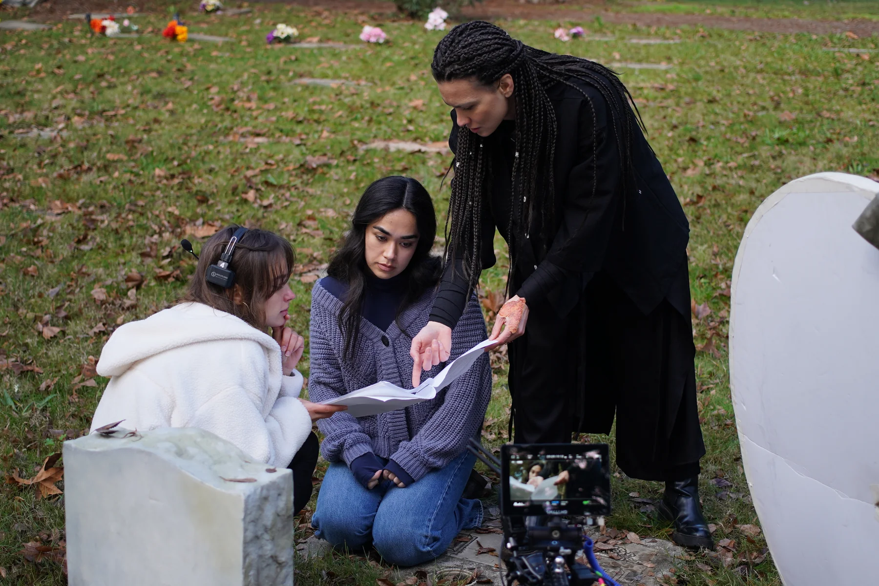
Developed over the course of a year — received a grant through the Sonscreen Film Festival pitch competition. As writer, director and producer I led the project from concept to production with a team of 20+. I also created a full marketing package: press kit, synopsis, director's statement, Q&A, press release, festival cover letter and festival strategy.

Albedo film poster on illuminated city bus stop at night
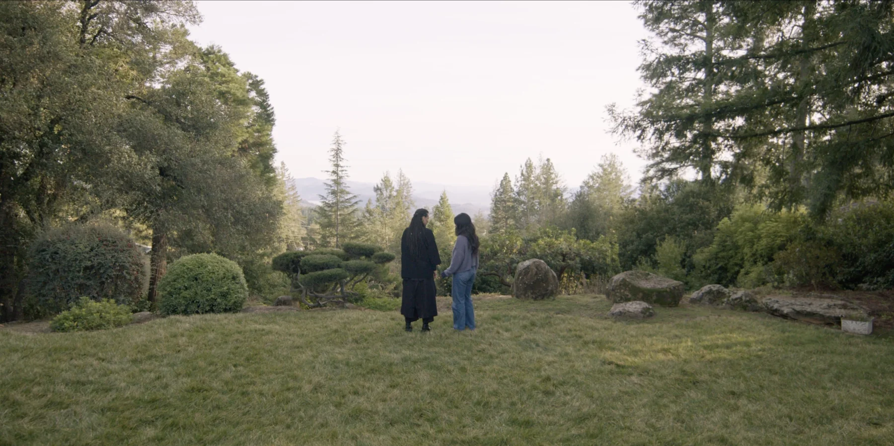
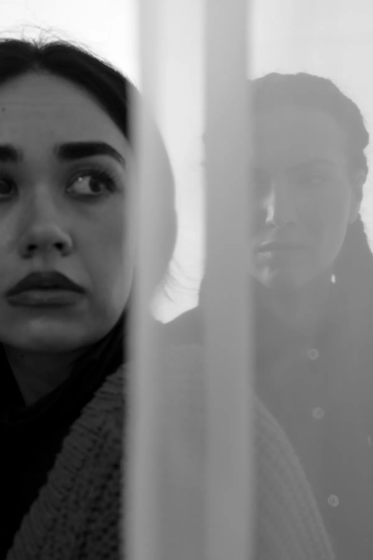
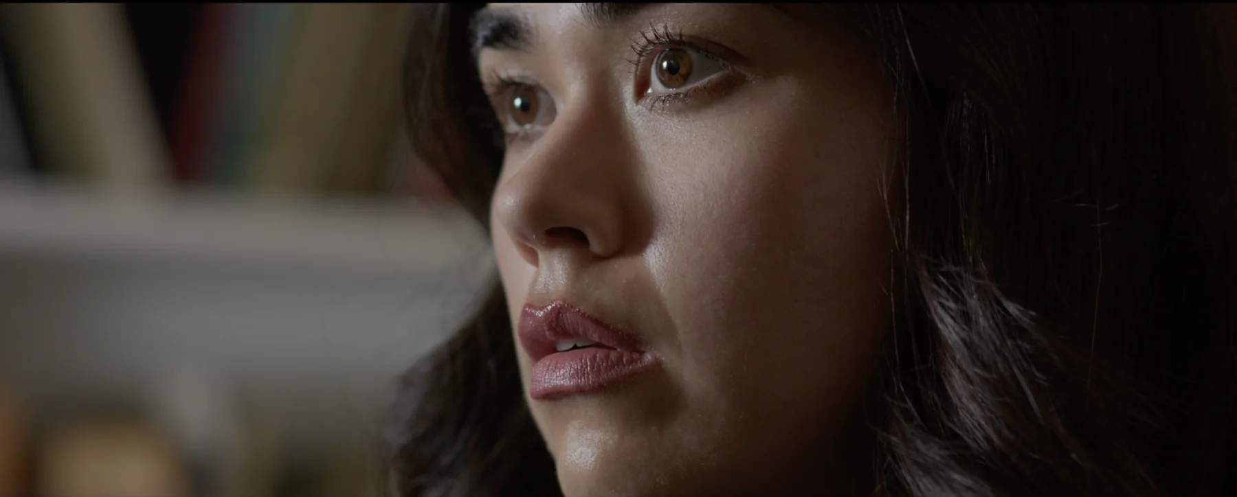
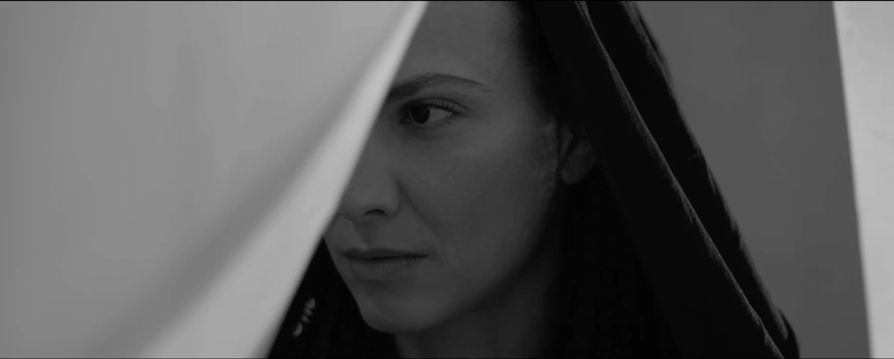
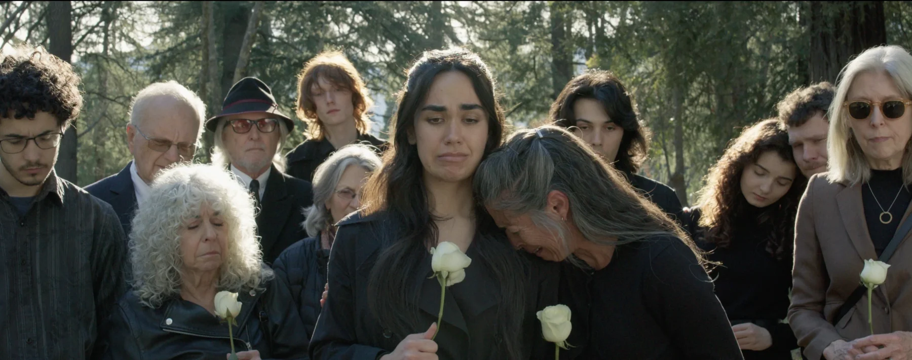
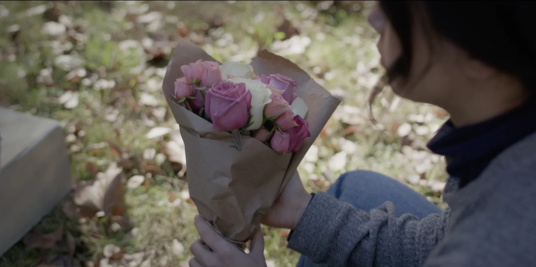
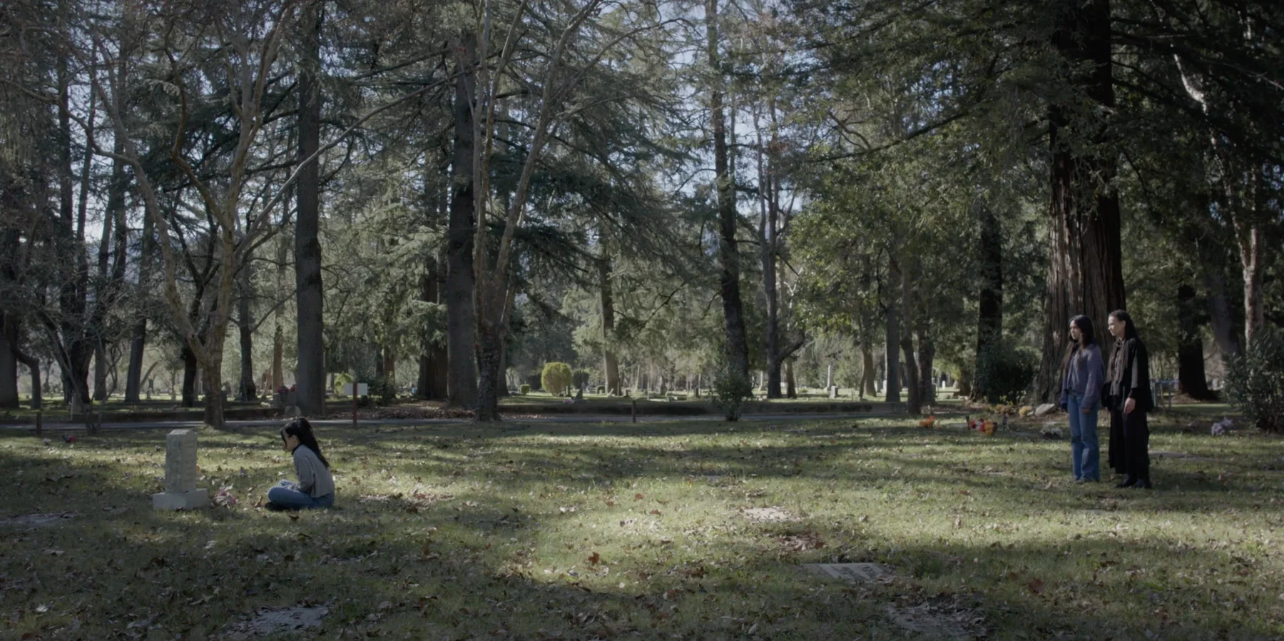
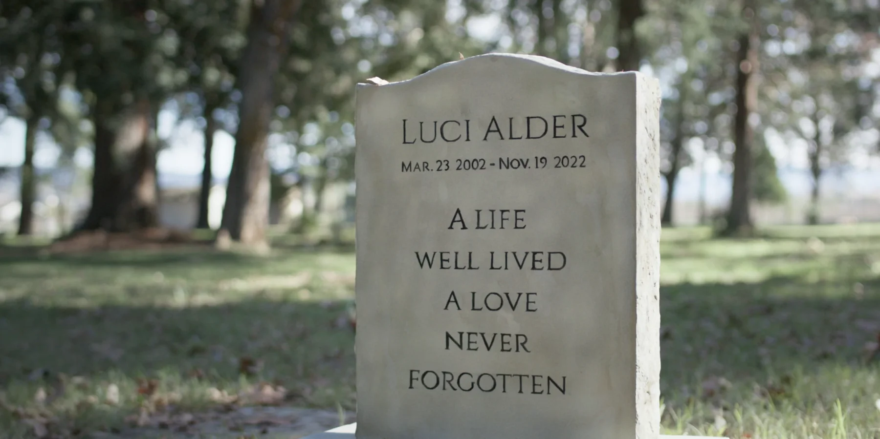
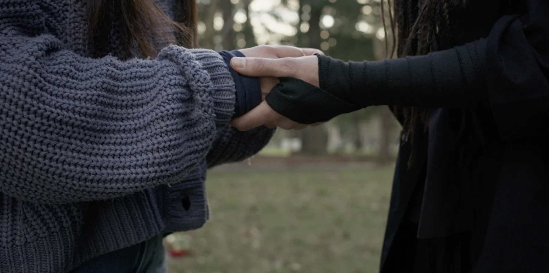
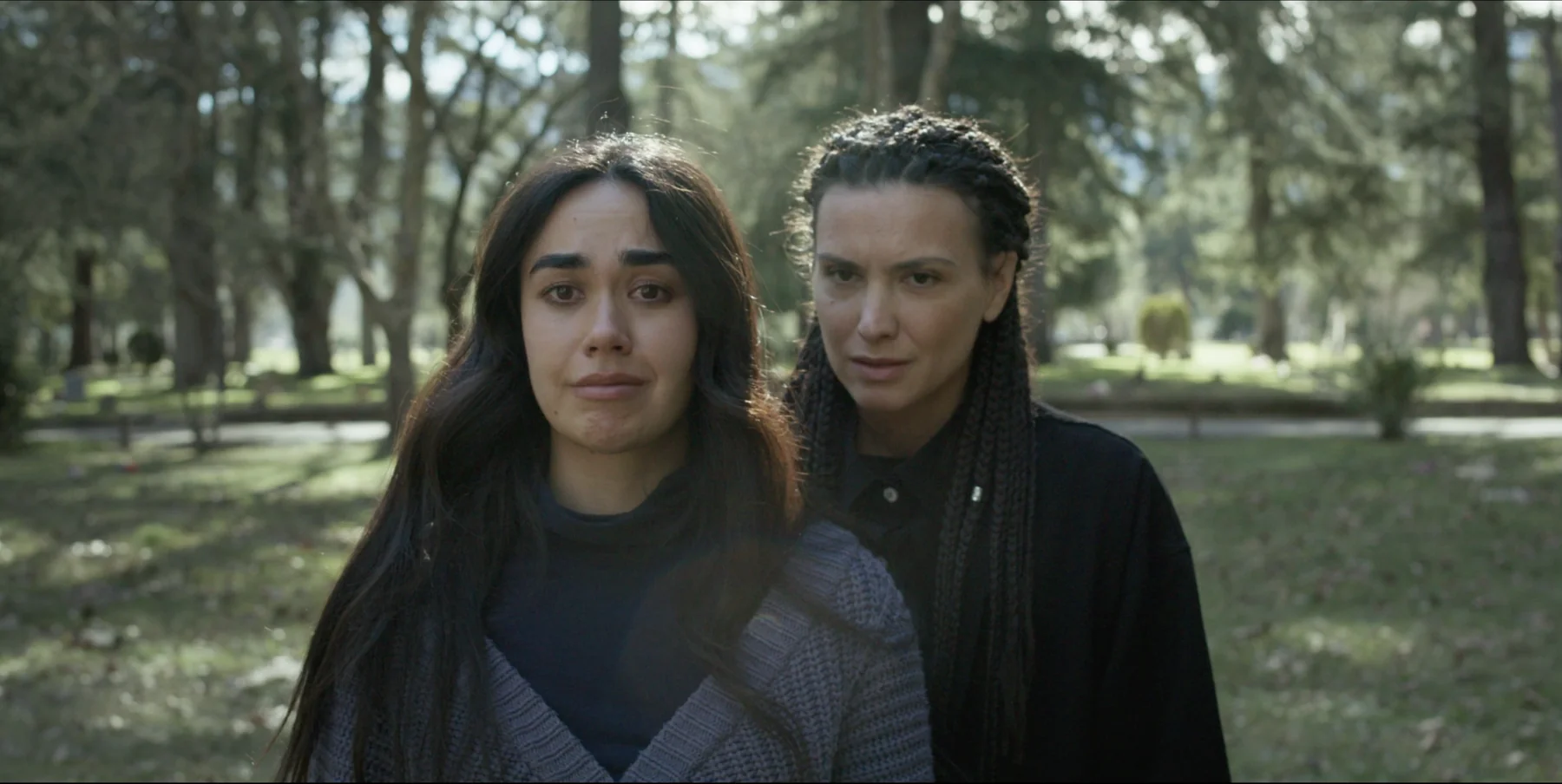
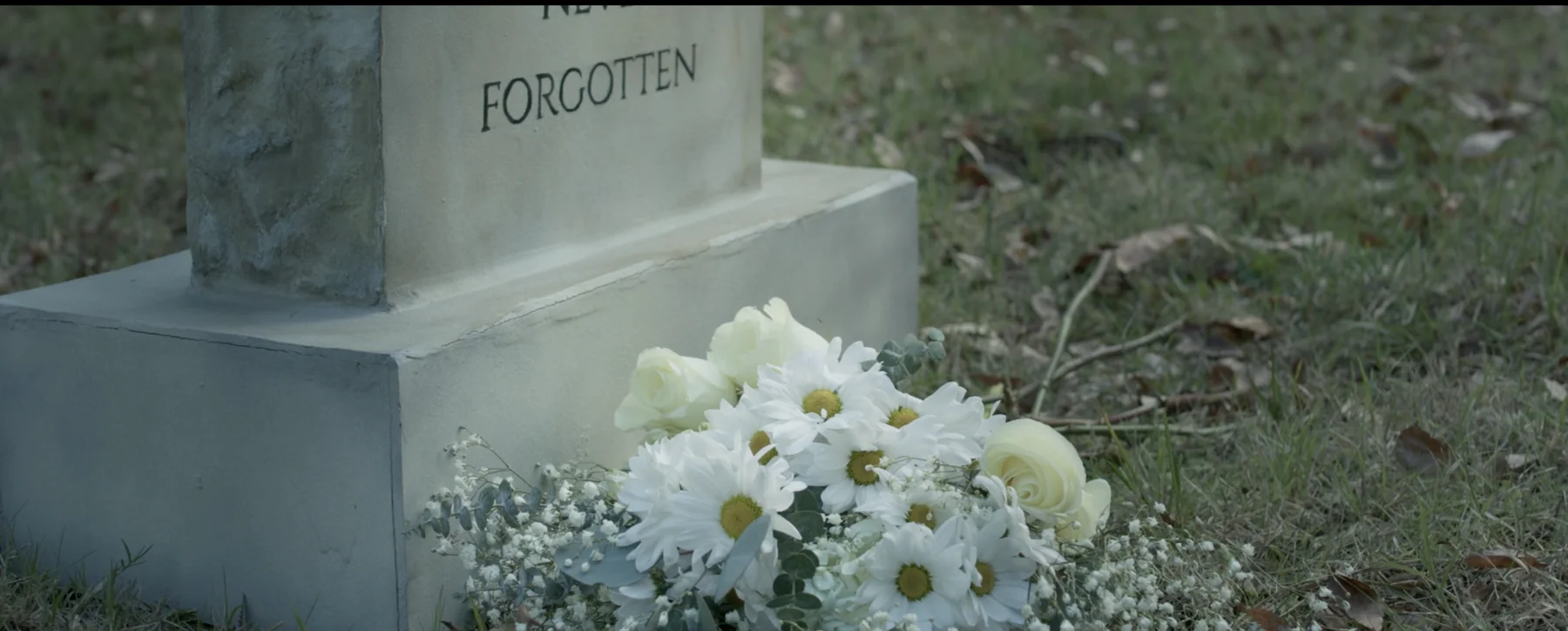
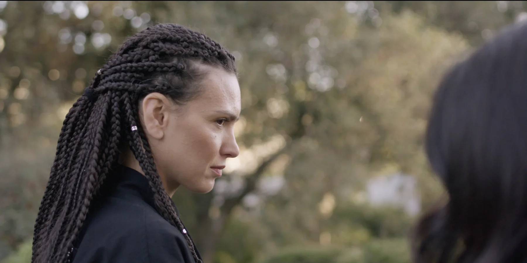
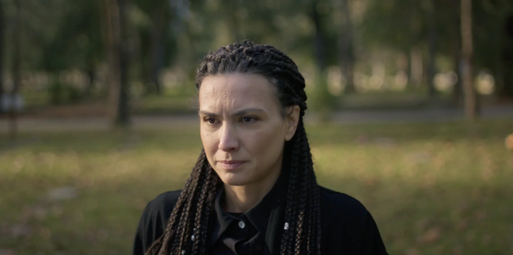
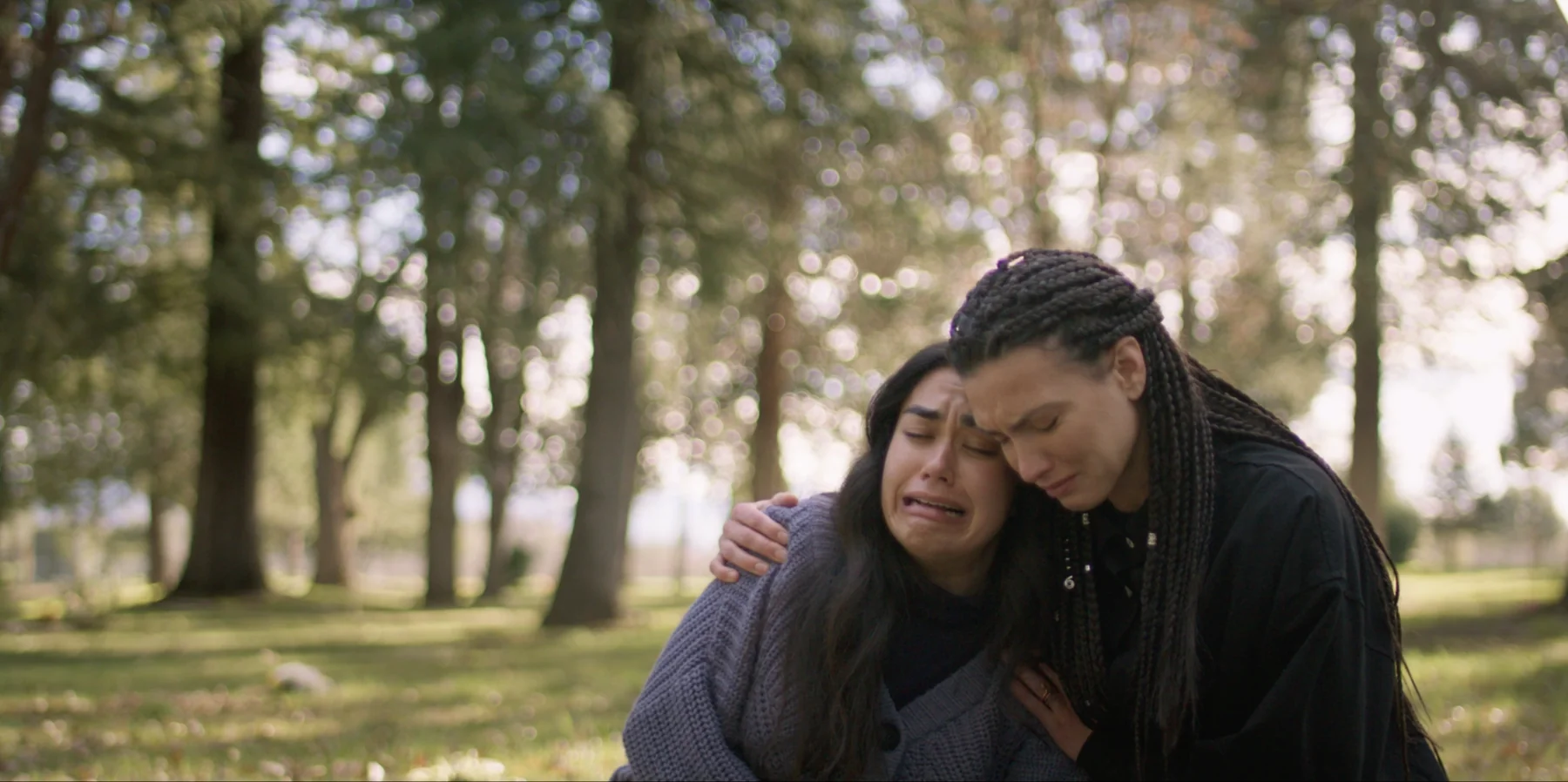
Albedo film stills — character moments, cemetery, family, intimate close-ups
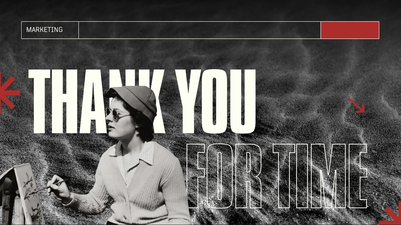
Albedo marketing package — press release, festival sheet, director's Q&A, film synopsis
Full marketing package designed in-house for festival submissions.
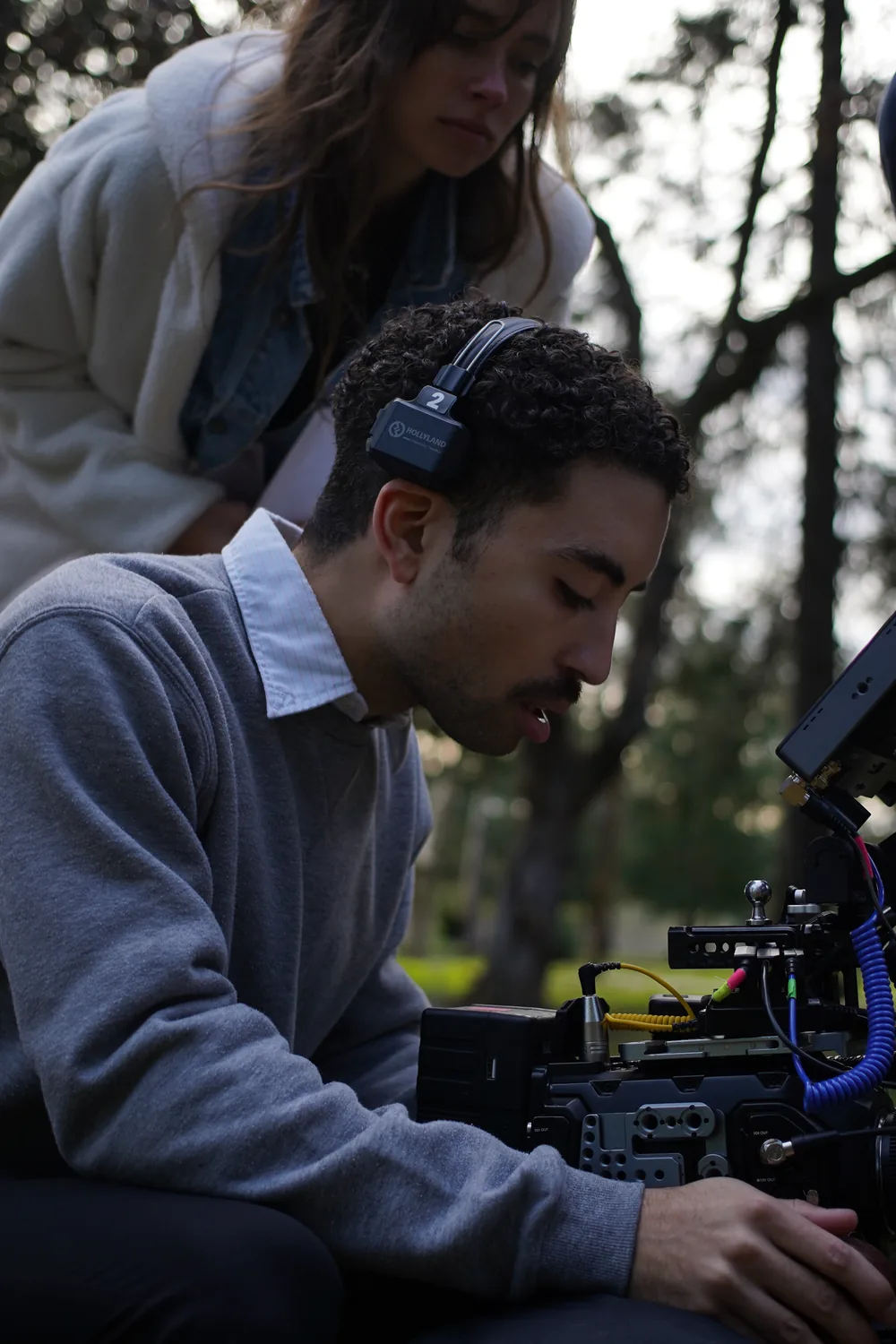
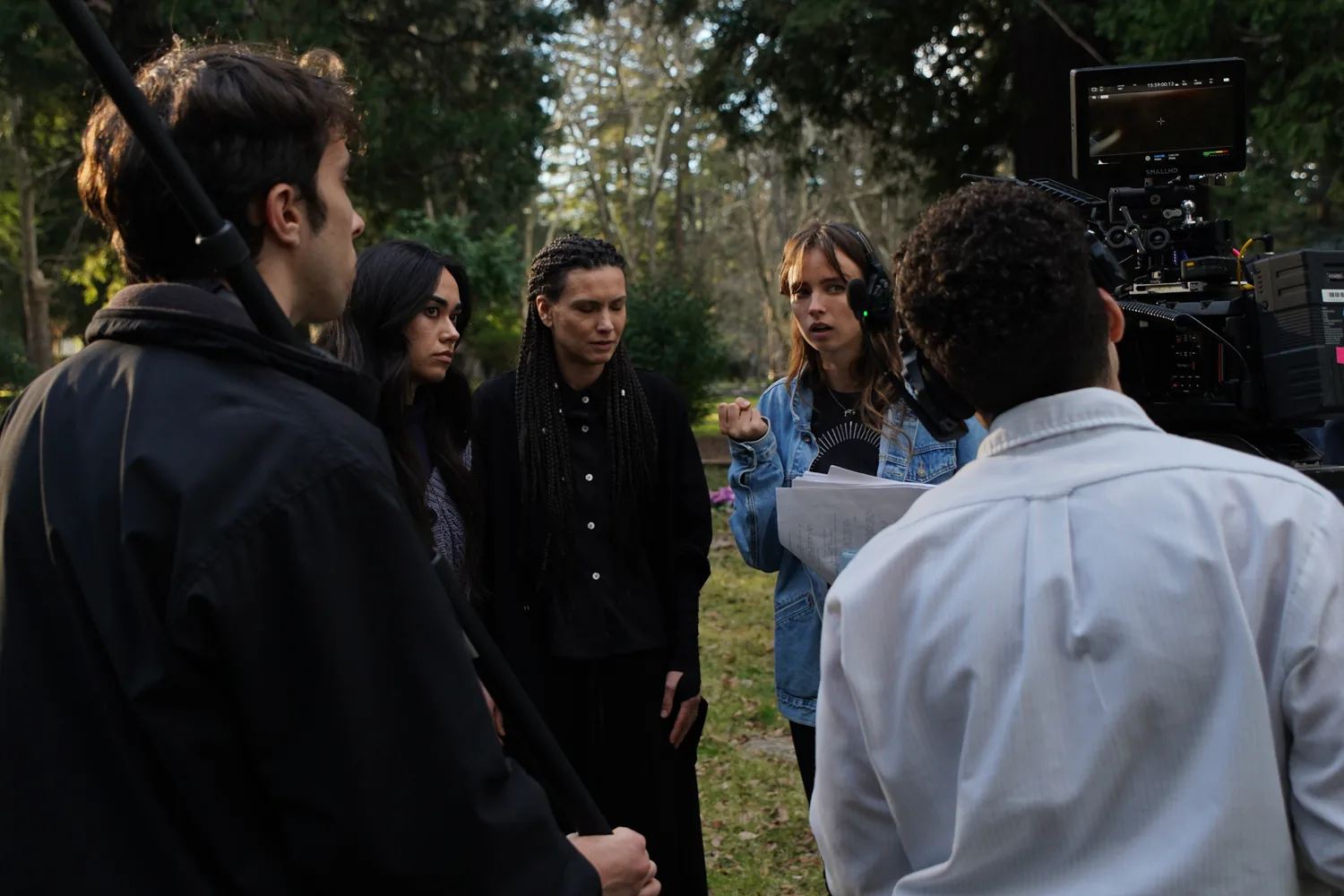
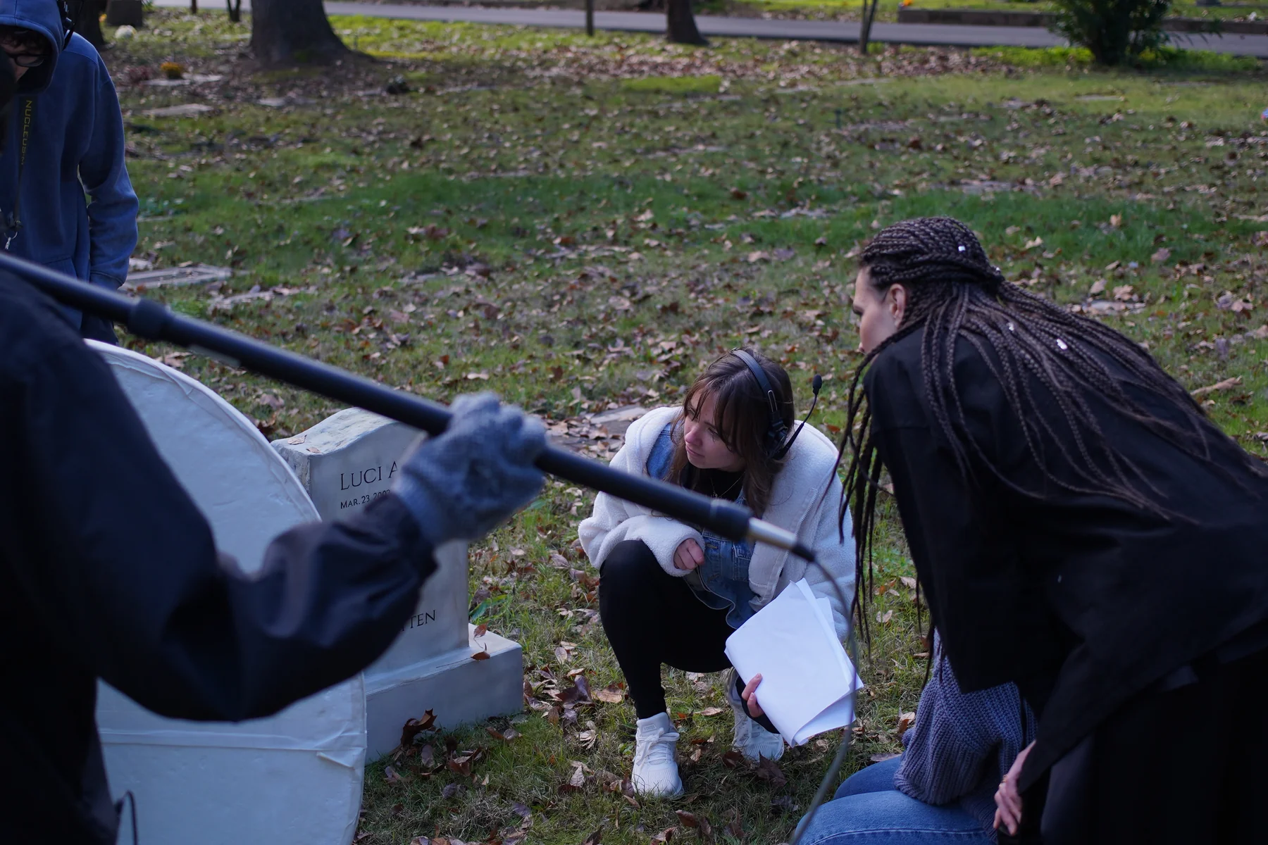
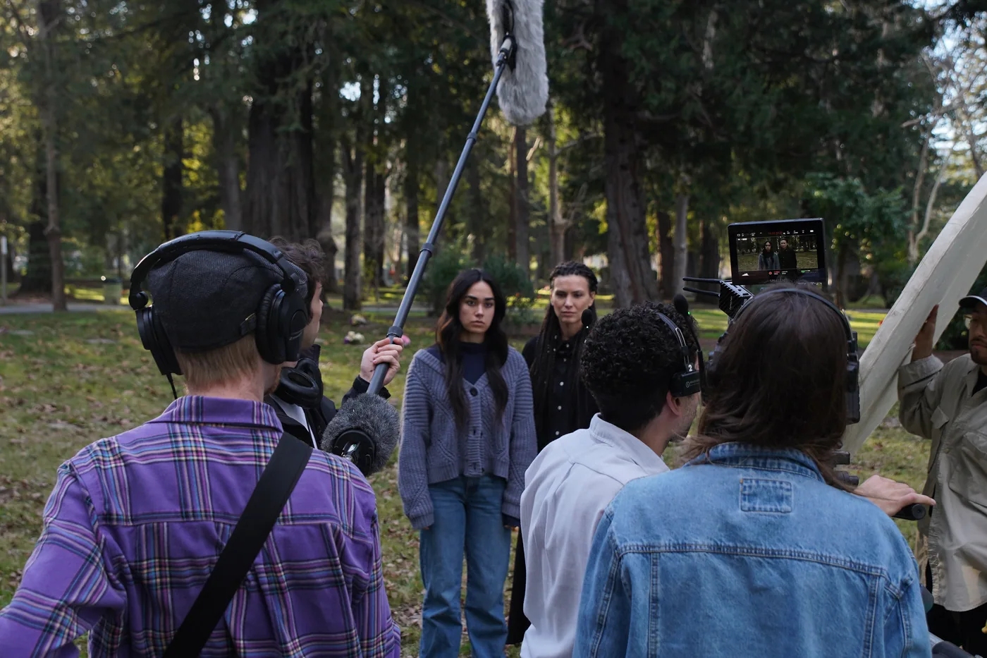
Albedo behind the scenes — crew with reflectors, cast and crew group photo, on-set direction
Behind the scenes — directing on location with the production crew.

Let’s make something

Tell your story with me.

kapopravkina@gmail.com